Python使用pandas为excel绘制柱形图
pandas对excel表制作单个柱形图时出现了问题。
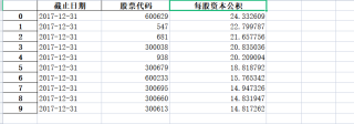
excel表如下:
代码如下:
import matplotlib.pyplot as plt
import pandas as pd

plt.rcParams['font.sans-serif']=['SimHei']
plt.rcParams['axes.unicode_minus'] = False

reverse_2017 = pd.read_excel("reserve_2017.xlsx", "Sheet1")
fig = plt.figure()
plt.bar(x=reverse_2017["股票代码"],height=reverse_2017["每股资本公积"])
plt.title('2017年每股资本公积')
plt.xlabel('股票代码')
plt.ylabel('每股资本公积')
plt.show()
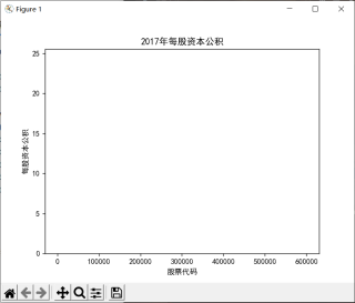
当我绘制出柱形图时,好像X轴跨度太大,无法显示。
但是我想达到的效果是
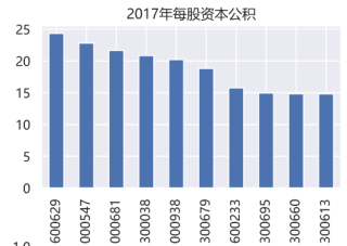
我该如何处理才能变成以上的效果?
参考
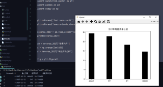
import matplotlib.pyplot as plt
import pandas as pd
import numpy as np


plt.rcParams['font.sans-serif'] = ['SimHei']
plt.rcParams['axes.unicode_minus'] = False

reverse_2017 = pd.read_excel("test.xlsx", "Sheet1")
print(reverse_2017)

x0 = reverse_2017["股票代码"]
x = np.arange(len(x0))
y = reverse_2017["每股资本公积"]

fig = plt.figure()
plt.bar(x, y, color="k", edgecolor="k", width=0.3, tick_label=x0)
plt.title('2017年每股资本公积')

plt.show()
如果你的数据没有问题,你的代码是正确的。可能你的数据量太多了。你可以尝试先少来几个数据,比如10个
reverse_2017 = pd.read_excel("reserve_2017.xlsx", "Sheet1")[0:10]
plt.xticks(rotation=90)#x轴倾斜