flex布局如何垂直居中对齐
我已经用了flex把他分为两块了,左边的,因为是文字,我直接就加了行高就居中对齐了,那右边的我因为有边框,所以我文字在边框内水平居中,已经加过行高了,那么这种情况如何让右边的也垂直居中对齐呢,用flex有什么办法做到吗,还是需要用到定位或者margin之类的来对齐?
<template>
<div>
<div class="wrap">
<div class="box">
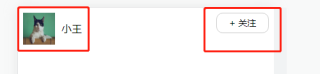
<img src="https://img01.yzcdn.cn/vant/cat.jpeg" alt="" style="width:50px;height:50px;">
<span style="line-height: 50px;margin-left:10px">小王</span>
</div>
<div class="text">+ 关注</div>
</div>
</div>
</template>
<script>
export default {
name: "App",
};
</script>
<style scoped>
.wrap{
display: flex;
justify-content:space-between;
}
.box{
height: 50px;
display: flex;
}
.text{
height: 30px;
width: 80px;
border: 1px solid #ccc;
text-align: center;
line-height: 30px;
border-radius: 10px;
font-size: 14px;
}
</style>
.wrap{
  align-items:center;
}
两种方法第一种是给最外层的div设置所有子元素横轴对其方式,这个别人的回答里已经写了
.wrap{
  align-items:center;
}
还有一种是对单个物体设置
.text{
align-self:center;
}
两种方法一个是对flex元素内所有子元素有效一个是只对某一个有效,按实际情况选择用那个