vue页面等比例缩放如何做到没有留白并没有滚动条
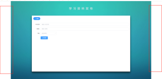
我是用页面整体的等比例缩放来按照1920*1080做的。然后做完了后F11放大缩小都是等比例的,布局不会乱。都显示在正常位置。但是当我正常浏览器浏览的时候就会出现两侧的白边没法解决。有没有办法能让白边没有,并没有滚动条的呢。
我的代码是这样的
等比例缩放的代码
// 屏幕适配 mixin 函数
// * 默认缩放值
const scale = {
width: '1',
height: '1',
}
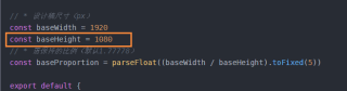
// * 设计稿尺寸(px)
const baseWidth = 1920
const baseHeight = 1080
// * 需保持的比例(默认1.77778)
const baseProportion = parseFloat((baseWidth / baseHeight).toFixed(5))
export default {
data() {
return {
// * 定时函数
drawTiming: null
}
},
mounted () {
//加载后先计算一遍缩放比例
this.calcRate()
//生成一个监听器:窗口发生变化从新计算计算一遍缩放比例
window.addEventListener('resize', this.resize)
},
beforeDestroy () {
window.removeEventListener('resize', this.resize)
},
methods: {
calcRate () {
//拿到整个页面元素
const appRef = this.$refs["zoom"]
//如果没有值就结束
if (!appRef) return
// 当前宽高比
const currentRate = parseFloat((window.innerWidth / window.innerHeight).toFixed(5))
//判断:如果有值代表页面变化了
if (appRef) {
//判断当前宽高比例是否大于默认比例
if (currentRate > baseProportion) {
scale.width = ((window.innerHeight * baseProportion) / baseWidth).toFixed(5)
scale.height = (window.innerHeight / baseHeight).toFixed(5)
//整个页面的元素样式,缩放宽高用当前同比例放大的宽高
appRef.style.transform = `scale(${scale.width}, ${scale.height}) translate(-50%, -50%)`
} else {
scale.height = ((window.innerWidth / baseProportion) / baseHeight).toFixed(5)
scale.width = (window.innerWidth / baseWidth).toFixed(5)
appRef.style.transform = `scale(${scale.width}, ${scale.height}) translate(-50%, -50%)`
}
}
},
resize () {
//先清除计时器
clearTimeout(this.drawTiming)
//开启计时器
this.drawTiming = setTimeout(() => {
this.calcRate()
}, 200)
}
},
}
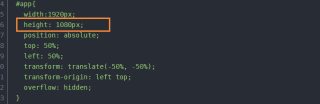
然后是在app.vue内的代码
<template>
  <div id="app" ref="zoom">
    <router-view />
  </div>
</template>
<script>
import drawMixin from "@/utils/drawMixin.js"; //自适应缩放
export default {
  mixins: [drawMixin],
}
</script>
<style lang="scss" scoped>

#app{
  width:1920px;
  height: 1080px;
  position: absolute;
  top: 50%;
  left: 50%;
  transform: translate(-50%, -50%);
  transform-origin: left top;
  overflow: hidden;
}
</style>
看你这意思,你是想做可视化大屏那样的东西扒,同比例缩放宽度或者高度占满浏览器。
有一点得注意,在1980分辨率下面,浏览器内容高度并没有1080的,你试试把初始值改成937px
你要改的是 #app里面的盒子,不是#app
可以使用rem单位,使用媒体查询在不同的分辨率下改变1rem = ?px