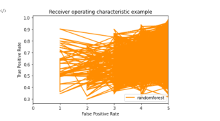
ROC曲线画出来混乱线
问题遇到的现象和发生背景
今天在做建模分析的时候,用到随机森林处理多分类问题,最后画出的ROC曲线很奇怪,想知道这是什么原因造成的。
问题相关代码
import numpy as np
from sklearn.metrics import multilabel_confusion_matrix
from sklearn.metrics import classification_report,roc_auc_score

pred_y_quant = rf.predict_proba(Xtest)
con = multilabel_confusion_matrix(Ytest,rf.predict(Xtest),labels=[1.0,2.0,3.0,4.0,5.0])
print(classification_report(Ytest,rf.predict(Xtest),labels=[1.0,2.0,3.0,4.0,5.0]))
# macro avg       0.52      0.40      0.42      4646 weighted avg       0.71      0.72      0.70      4646
#AUC
AUC = roc_auc_score(np.array(Ytest),np.array(pred_y_quant),multi_class='ovo')
print('AUC:',auc)
pred_y_score = []
for i in pred_y_quant:
    pred_y_score.append(max(i))
#ROC
plt.figure()
lw = 2
plt.plot(np.array(Ytest),np.array(pred_y_score),color='darkorange',
         lw=lw,label = 'randomforest')
plt.plot(color='navy', lw=lw, linestyle='--')
plt.xlim([0.0, 5.0])
#plt.ylim([0.0, 1.05])
plt.xlabel('False Positive Rate')
plt.ylabel('True Positive Rate')
plt.title('Receiver operating characteristic example')
plt.legend(loc="lower right")
plt.show()
运行结果及报错内容
我想要达到的结果
画出正确的ROC曲线
我感觉你写得不对,以下代码供你参考
import numpy as np
import pandas as pd
import matplotlib.pyplot as  plt
from sklearn.metrics import multilabel_confusion_matrix
from sklearn.metrics import classification_report,roc_auc_score
from sklearn.ensemble import RandomForestClassifier
from sklearn.ensemble import RandomForestRegressor
from sklearn.datasets import make_blobs

from sklearn import svm

#使用最初的X和y,样本不均衡的这个模型
class_1 = 500 #类别1有500个样本
class_2 = 50 #类别2只有50个
centers = [[0.0, 0.0], [2.0, 2.0]] #设定两个类别的中心
clusters_std = [1.5, 0.5] #设定两个类别的方差,通常来说,样本量比较大的类别会更加松散
X, y = make_blobs(n_samples=[class_1, class_2],
                  centers=centers,
                  cluster_std=clusters_std,
                  random_state=0, shuffle=False)

plt.scatter(X[:, 0], X[:, 1], c=y, cmap="rainbow",s=10)


clf_proba = RandomForestClassifier(n_estimators = 8).fit(X,y)
y_predict = clf_proba.predict(X)
ypredict = clf_proba.predict_proba(X)

from sklearn.metrics import roc_curve
FPR, recall, thresholds = roc_curve(y,ypredict[:,1], pos_label=1)


from sklearn.metrics import roc_auc_score as AUC
area = AUC(y,ypredict[:,1])
print(area)

from sklearn.metrics import confusion_matrix
cm= confusion_matrix(y, y_predict)
print(cm)

plt.figure()
plt.plot(FPR, recall, color='red',
         label='ROC curve (area = %0.4f)' % area)
plt.plot([0, 1], [0, 1], color='black', linestyle='--')
plt.xlim([-0.05, 1.05])
plt.ylim([-0.05, 1.05])
plt.xlabel('False Positive Rate')
plt.ylabel('Recall')
plt.title('Receiver operating characteristic example')
plt.legend(loc="lower right")
plt.show()
尝试用一下这个形式
plt.plot(range(len(real_data)),real_data,'r',label='real_data',linewidth=3)
或者参考文中随机森林模型的代码
【实战】——基于机器学习回归模型对广州二手房价格进行分析及模型评估_貮叁的博客-CSDN博客
如有用请采纳