HTML+CSS可以制作出弧形文字吗?
假设有一个圆形,可以使用css制作出文字环绕圆周显示的样式吗?
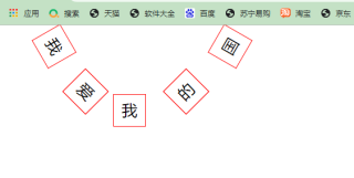
可以的。利用定位,再加上css3的变换属性,transform,roate(***deg)就可以实现。各种位置角度都能实现。给你写了个例子,你copy运行下就可以。如果对你有帮助,点下采纳一下,谢谢。
<!DOCTYPE html>
<html>
    <head>
        <meta charset="utf-8" />
        <title></title>
        <style type="text/css">
            div{
                width: 50px;
                height: 50px;
                border: 1px solid red;
                font-size: 25px;
                color: black;
                text-align: center;
                line-height: 50px;
                position: absolute;
            }
            #box{
                left: 60px;
                transform:rotate(60deg);
            }
            #box1{
                left: 110px;
                top: 80px;
                transform:rotate(45deg);
            }
            #box2{
                left: 180px;
                top: 110px;
            }
            #box3{
                left: 270px;
                top: 80px;
                transform:rotate(-45deg);
            }
            #box4{
                left: 340px;
                transform:rotate(-60deg);
            }
        </style>
    </head>
    <body>
        <div id="box">我</div>
        <div id="box1">爱</div>
        <div id="box2">我</div>
        <div id="box3">的</div>
        <div id="box4">国</div>
    </body>
</html>
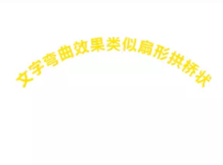
通过文字平滑弯曲弧形效果的插件-arctext.js来实现
1.创建一个容器装文字
<h3 id="title">文字弯曲效果类似扇形拱桥状</h3>
2.引入jquery和arctext.js
<script type="text/javascript"  src="//code.jquery.com/jquery-1.8.2.min.js" ></script>
<script src="jquery.arctext.js"></script>
3.调用arctext的方法:
$(function(){
        $("#title").show().arctext({
            radius:180
        })
    })
完整效果
<!DOCTYPE html>
<html>
<head lang="en">
    <meta charset="UTF-8">
    <title></title>
    <style>
      #title{
            font-size: 20px;
            color: #ffe400;
            text-align: center;
        }
    </style>
</head>
<body>
    <h3 id="title">文字弯曲效果类似扇形拱桥状</h3>
<script type="text/javascript"  src="//code.jquery.com/jquery-1.8.2.min.js" ></script>
<script src="jquery.arctext.js"></script>
<script>
    $(function(){
        $("#title").arctext({
            radius:180
        })
    })
</script>
</body>
</html>