这种相反的圆角要怎么实现?
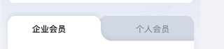
图中的这种要怎么实现,百度都是向内凹的圆角,一直找不到这种效果
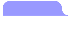
用css圆形渐变背景做,代码如下:(如有帮助,望采纳!谢谢! 点击我这个回答右上方的【采纳】按钮)
<!doctype html>
<html lang="en">
<head>
    <meta charset="UTF-8" />
    <meta name="viewport" content="width=device-width, initial-scale=1.0">
    <meta http-equiv="X-UA-Compatible" content="IE=edge,chrome=1" />
    <title> 页面名称 </title>
<style type="text/css">
#div {
    width: 200px;
    height: 50px;
    background-color: #99f;
    border-radius: 25px 25px 0px 0px;
    position: relative;
}
#div:before {
    content: "";
    display: block;
    width: 25px;
    height: 25px;
    position: absolute;
    left: 100%;
    bottom: 0;
    background-image: radial-gradient(at top right, transparent 71%, #99f 0%);
}

</style>
</head>
<body>

<div id="div"></div>
</body>
</html>
1.需要多造几个盒子,一层做内容,一层做边框,一层做背景色;
2.设置不同的层级


这种外圆角用css写出来弧度不会平整,从楼上的图片看的出来,设计思路可以用2个带有外圆角的背景图切换z-index层级互相遮盖达到效果。