ElementPlus 的 el-button 的 icon prop,如何使用自定义 svgicon,网上例子都是直接写标签,我这是要传入 prop。
我自己的代码是:
<script setup>
import { ElButton } from 'element-plus';
import { ref } from 'vue';
import SvgIcon from '../utils/SvgIcon.vue';

const isPause = ref(false);

// 根据网上 vite-plugin-svg-icons 教程写的
const playIcon = () => <SvgIcon name="play"/>

</script>

<template>
     <el-button v-if="isPause" type="primary" size="small">Pause</el-button>
     / / 这里 icon="playIcon"
     <el-button v-else type="primary" icon="playIcon" size="small"></el-button>
</template>

<style scoped lang="scss"></style>
报错:
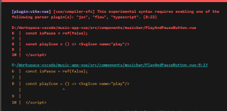
查了一下,似乎这是 JSX 语法,Vue 不支持,虽然还看到可以用 Babel 但是我不知道 “正规写法”应该长啥样?
难道是嵌套?我用 React 的经验,组件有许多内部布局,比如右对齐,间隔等。嵌套法真的不是一个传入图标的好方法。
我看 el-button 文档写 icon prop 接受 string / Component 。
如何传进去?
【以下回答由 GPT 生成】
问题的解决思路如下:
首先,我们需要确保自定义的 SVG 图标组件(SvgIcon)已经正确引入并可以在其他地方正常使用。
我们可以通过在 el-button 组件的 icon prop 中传入一个字符串,来指定使用的自定义 SVG 图标的名称。
在 el-button 组件中,可以使用插槽(slot)来渲染 icon。我们可以创建一个名为 icon 的插槽,并在其中使用自定义 SVG 图标组件来渲染。
下面是具体的代码实现:
<script setup>
import { ElButton } from 'element-plus';
import { ref } from 'vue';
import SvgIcon from '../utils/SvgIcon.vue';

const isPause = ref(false);
</script>

<template>
  <el-button v-if="isPause" type="primary" size="small">Pause</el-button>

  <el-button v-else type="primary" size="small">
    <template #icon>
      <!-- 这里使用自定义 SVG 图标组件 -->
      <svg-icon name="play" />
    </template>
  </el-button>
</template>
在上述代码中,我们使用了 el-button 组件,并在插槽中使用了自定义 SVG 图标组件 <svg-icon>。我们将传入的自定义 SVG 图标的名称作为 name 属性传给 <svg-icon> 组件,以便正确渲染对应的图标。
请注意,上述代码假设你已经正确引入了 ElementPlus 和自定义的 SvgIcon 组件,并且已经在项目中设置好相关的构建配置。如果你遇到了其他问题,请提供更多的代码和错误信息,以便我能够更准确地帮助你解决问题。
如果你已经解决了该问题, 非常希望你能够分享一下解决方案, 写成博客, 将相关链接放在评论区, 以帮助更多的人 ^-^
在 Element Plus 中,el-button 组件的 icon 属性允许你添加一个图标。如果你想使用自定义的 SVG 图标,你可以考虑将 SVG 图标转换为 Vue 组件,然后将该组件作为 icon 属性的值。
以下是一个示例:
首先,创建一个 Vue 组件来表示你的 SVG 图标。假设我们将它保存为 MyIcon.vue:
<template>
  <svg ...>
    <!-- 在这里插入你的 SVG 路径 -->
  </svg>
</template>
然后,你可以在 el-button 中使用 MyIcon 组件作为 icon:
<template>
  <el-button>
    <MyIcon /> <!-- 使用你的自定义 SVG 图标 -->
    Button Text
  </el-button>
</template>

<script>
import MyIcon from './MyIcon.vue'; // 确保路径正确

export default {
  components: {
    MyIcon,
  },
};
</script>
注意,如果你使用的是 Vue 3,你可能需要使用 setup 方法来导入和使用 MyIcon 组件:
<template>
  <el-button>
    <MyIcon /> <!-- 使用你的自定义 SVG 图标 -->
    Button Text
  </el-button>
</template>

<script>
import { ref } from 'vue';
import MyIcon from './MyIcon.vue'; // 确保路径正确

export default {
  setup() {
    const MyIconComponent = ref(MyIcon);

    return {
      MyIconComponent,
    };
  },
  components: {
    MyIcon: MyIconComponent,
  },
};
</script>