r语言-决策曲线分析DCA图不完整
library('rmda')
library('ggDCA')
library('ggplot2')
library('rms')
library('caret')
library('survival')
library('survminer')
library('xlsx')
data1 <- read.xlsx('D:/desktop/temp_CHD.xlsx',1)

cph1 <- cph(Surv(survival_30,status_30) ~
              ad_type
            + gender + age + race
            + af + ckd + copd + dm + hl + ht
            + oldmi + precar + plt + wbc
            + crea + hemoglo + hemato
            + glu,data = data1)
cph2 <- cph(Surv(survival_30,status_30) ~
                gender + age + race,data = data1)

dca_cph <- dca(cph1,cph2,model.names = c("Full model", "Basic model"))
ggplot(dca_cph,linetype = c(1,1,2,2),
       color = c('#0070b9','#ec008c','grey','black'))
  # +xlim(0.1, 0.5)
  # +ylim(-0.1,0.4)

巨佬们帮忙瞧瞧,为什么粉线看起来不全啊?粉线单独跑也是不全的qaq
引用 皆我百晓生 小程序回复内容作答:
根据您提供的代码,粉线不完整的问题可能是由于缺少一些绘图参数所引起的。您可以尝试添加以下代码来修改绘图参数,以确保粉线完整显示:
ggplot(dca_cph, linetype = c(1, 1, 2, 2), color = c('#0070b9', '#ec008c', 'grey', 'black')) +
  xlim(0, 0.5) +
  ylim(-0.1, 0.4) +
  guides(linetype = guide_legend(override.aes = list(size = 1.5, color = c('#0070b9', '#ec008c', '#ec008c', 'black'))))
在这个例子中,我们使用xlim和ylim函数分别设置x轴和y轴的坐标范围,以确保粉线完整显示。我们还使用guides函数设置图例的样式,以使其与线条颜色一致。
另外,您的最后一行代码img无法运行,建议删除或修改它以避免错误。
【相关推荐】
- 这篇文章:达梦Dca认证学习(1)-安装数据库并创建数据库实例 也许能够解决你的问题,你可以看下
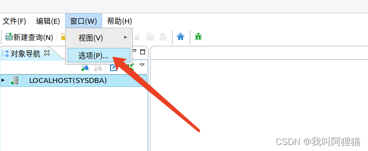
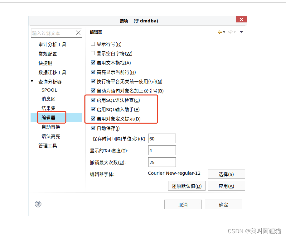
- 除此之外, 这篇博客: 全网最全 2022年最新达梦DCA认证考题 考前复习(内部资料,随时删除)中的 2.2.1 图形化界面开启语法提示 部分也许能够解决你的问题, 你可以仔细阅读以下内容或跳转源博客中阅读:
如果你已经解决了该问题, 非常希望你能够分享一下解决方案, 写成博客, 将相关链接放在评论区, 以帮助更多的人 ^-^