pc和移动端加载不同布局
朋友们,现在这么写,可以判断出打开页面时,是pc端还是移动端,然后我想pc加载pc的布局,移动端加载移动端的布局,这个需要怎么去写呀,
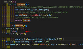

created() {
     function IsPhone() {
            //获取浏览器navigator对象的userAgent属性(浏览器用于HTTP请求的用户代理头的值)
            var info = navigator.userAgent;
            //通过正则表达式的test方法判断是否包含“Mobile”字符串
            var isPhone = /mobile/i.test(info);
            //如果包含“Mobile”(是手机设备)则返回true
            return isPhone;
        }
        if (IsPhone()){
    console.log('移动');
        }else{
    console.log('pc');

            console.log(document.body.clientWidth+0.00);
    this.a=(document.body.clientWidth)/1280
    document.getElementsByTagName("body")[0].style.setProperty("--a", this.a);
        }
  },
        mounted() {
            let u = navigator.userAgent
            if (u.match(/AppleWebKit.*Mobile.*/) != null) {
                document
                    .getElementsByTagName('meta')[2]
                    .setAttribute(
                        'content',
                        'width=device-width, initial-scale=0.4, minimum-scale=0.4, maximum-scale=0.4, user-scalable=no'
                    )
            }
        }
你直接跳转到不同的页面不就得了,为什么非要把两种不相干的布局写在同一个页面里面
你通用的js可以是同一个文件,后端也可以访问同一个接口,就html分开写
那就定义两套路由,本身router.js文件也可以抓取到对应的判断
写个 if else 去判断相等即可
this.$router.push 跳转