不明白为什么用transform: scale之后动画缩放不在中心点缩放?
html>
<html lang="en">

<head>
    <meta charset="UTF-8">
    <meta http-equiv="X-UA-Compatible" content="IE=edge">
    <meta name="viewport" content="width=device-width, initial-scale=1.0">
    <title>Documenttitle>
    <style>
        * {
            margin: 0;
            padding: 0;
        }

        body {
            background-color: #333;
        }

        .map {
            position: relative;
            width: 747px;
            height: 616px;
            background: url(images/map.png) no-repeat;
            margin: 0 auto;
        }

        .city {
            position: absolute;
            top: 227px;
            right: 193px;
            color: #fff;
        }

        .tb {
            top: 500px;
            right: 80px;
        }

        .dotted {
            width: 8px;
            height: 8px;
            background-color: #09f;
            border-radius: 50%;

        }

        .city div[class^="pulse"] {
            /* 保证小波纹在父盒子里垂直居中 放大之后会中心向四周发散 */
            position: absolute;
            top: 50%;
            left: 50%;
            transform: translate(-50%, -50%);
            width: 8px;
            height: 8px;
            box-shadow: 0 0 12px #009dfd;
            border-radius: 50%;
            animation: pulse 1.2s linear infinite;
        }

        .city div.pulse2 {
            animation-delay: 0.5s;
        }

        .city div.pulse3 {
            animation-delay: 0.8s;
        }

        @keyframes pulse {
            0% {}

            70% {
                /* 不要用scale */
                transform: scale(2);
                /* width: 40px;
                height: 40px; */
                opacity: 1;
            }

            100% {
                width: 70px;
                height: 70px;
                opacity: 0;
            }
        }
    style>

head>

<body>
    <div class="map">
        <div class="city">
            <div class="dotted">div>
            <div class="pulse1">div>
            <div class="pulse2">div>
            <div class="pulse3">div>
        div>
        <div class="city tb">
            <div class="dotted">div>
            <div class="pulse1">div>
            <div class="pulse2">div>
            <div class="pulse3">div>
        div>
    div>
body>

html>
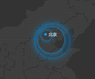
单独来说为啥不在中心点,因为默认是以左上角为0,0点,你需要设置为中心点,属性为transtion-origin:(50%,50%),试下,大概就这意思吧
不要用scale,因为它会使阴影也变大。
不要问我怎么知道的,pink老师说的
@keyframes pulse {
       0% {}
       70% {
              width: 40px;
              height: 40px;
             opacity: 0.5;
         }
     100% {
              width: 70px;
              height: 70px;
             opacity: 0;
         }
        }