绘制平滑的ROC曲线
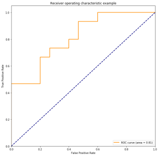
使用下面的程序绘制的ROC曲线是有很多棱角的,我想获得平滑的曲线该怎么办呢
import numpy as np
import matplotlib.pyplot as plt
from sklearn import svm, datasets
from sklearn.metrics import roc_curve, auc  ###计算roc和auc
from sklearn import model_selection

# Import some data to play with
iris = datasets.load_iris()
X = iris.data
y = iris.target

##变为2分类
X, y = X[y != 2], y[y != 2]

# Add noisy features to make the problem harder
random_state = np.random.RandomState(0)
n_samples, n_features = X.shape
X = np.c_[X, random_state.randn(n_samples, 200 * n_features)]

# shuffle and split training and test sets
X_train, X_test, y_train, y_test = model_selection.train_test_split(X, y, test_size=.3,random_state=0)

# Learn to predict each class against the other
svm = svm.SVC(kernel='linear', probability=True,random_state=random_state)

###通过decision_function()计算得到的y_score的值,用在roc_curve()函数中
y_score = svm.fit(X_train, y_train).decision_function(X_test)

# Compute ROC curve and ROC area for each class
fpr,tpr,threshold = roc_curve(y_test, y_score) ###计算真正率和假正率
roc_auc = auc(fpr,tpr) ###计算auc的值
"""
from sklearn.metrics import roc_auc_score
roc_auc_score(y_test, y_score)
"""
plt.figure()
lw = 2
plt.figure(figsize=(10,10))
plt.plot(fpr, tpr, color='darkorange',
         lw=lw, label='ROC curve (area = %0.2f)' % roc_auc) ###假正率为横坐标,真正率为纵坐标做曲线
plt.plot([0, 1], [0, 1], color='navy', lw=lw, linestyle='--')
plt.xlim([0.0, 1.0])
plt.ylim([0.0, 1.05])
plt.xlabel('False Positive Rate')
plt.ylabel('True Positive Rate')
plt.title('Receiver operating characteristic example')
plt.legend(loc="lower right")
plt.show()
可以参考这个:
做一下拟合插值处理,来画出光滑的曲线:
Demo
import matplotlib.pyplot as plt

import numpy as np

from scipy import interpolate

# 设置距离

x = np.array([0, 1, 1.5, 2, 2.5, 3, 3.5, 4, 4.5, 5, 5.5, 6, 6.5, 70, 8, 9, 10])

# 设置相似度

y = np.array([0.8579087793827057, 0.8079087793827057, 0.7679087793827057, 0.679087793827057,

              0.5579087793827057, 0.4579087793827057, 0.3079087793827057, 0.3009087793827057,

              0.2579087793827057, 0.2009087793827057, 0.1999087793827057, 0.1579087793827057,

              0.0099087793827057, 0.0079087793827057, 0.0069087793827057, 0.0019087793827057,

              0.0000087793827057])

# 插值法之后的x轴值,表示从0到10间距为0.5的200个数

xnew = np.arange(0, 10, 0.1)

# 实现函数

func = interpolate.interp1d(x, y, kind='cubic')

# 利用xnew和func函数生成ynew,xnew数量等于ynew数量

ynew = func(xnew)

# 原始折线

plt.plot(x, y, "r", linewidth=1)

# 平滑处理后曲线

plt.plot(xnew, ynew)

# 设置x,y轴代表意思

plt.xlabel("The distance between POI and user(km)")

plt.ylabel("probability")

# 设置标题

plt.title("The content similarity of different distance")

# 设置x,y轴的坐标范围

plt.xlim(0, 10, 8)

plt.ylim(0, 1)

plt.show()
通过插值算法。