html代码在电脑和手机上自适应的方法(悬赏增加到100,解决加100-150元,提供了用到的两个css,问题已经自己解决,忽略)
问题遇到的现象和发生背景
写了一个flask小程序,在电脑端表现还不错,勉强可以使用,但是在手机端显示比较乱,百度了一下,发现通过调整html代码,实现网页自适应可以解决这个问题,希望大家谁有经验帮助改一改这个代码呀
问题相关代码,请勿粘贴截图
<DOCTYPE html>
<html lang="zh-cn">
<head>
<meta name="viewport" content="width=device-width, initial-scale=1.0"/>
<meta charset="utf-8"/>
<title>my cards</title>
<link href="http://fonts.googleapis.com/icon?family=Material+Icons" rel="stylesheet">
<link href="/static/css/materialize.min.css" rel="stylesheet">
<link href="/static/css/style.css" rel="stylesheet">
<link rel="shortcut icon" href="/static/favicon.ico" type="image/x-icon">
</head>
<body>
<div class="navbar">
<nav class="light-blue lighten-1" role="navigation">
<div class="nav-wrapper container"><a id="logo-container" class="brand-logo">计划清单</a>
<ul class="right hide-on-med-and-down">
<li><a class="waves-effect waves-light btn red signin">PCDA</a></li>
</ul>
<ul id="nav-mobile" class="side-nav">
<li><a href="/cards/category/1">待完成</a></li>
<li><a href="/cards/category/2">已完成</a></li>
</ul>
<a href="#" data-activates="nav-mobile" class="button-collapse"><i class="material-icons">menu</i></a>
</div>
</nav>
</div>
<span class="hide" id="category-count">{{ categories|length }}</span>
<span class="hide" id="items-count">{{ items|length }}</span>
<div class="container"><br>
<div class="row">
<form class="col s12 m10 l8 offset-m2 offset-l2" id="add-card-form" action="/cards/add_new_card" method="POST">
<div class="row">
<div class="input-field col s2 m2">
<select id="category-select" name="category">
{% if category_now.id == 2 %}
<option value="" selected disabled>选择分类</option>
{% else %}
<option value="{{ category_now.id }}" selected>{{ category_now.name }}</option>
{% endif %}
{% for category in categories %}
{% if category != category_now and category.id != 2 %}
<option value="{{ category.id }}">{{ category.name }}</option>
{% endif %}
{% endfor%}
</select>
</div>
<div class="input-field col s2 m2">
<input class="validate" id="card_headline" type="text" name="card_headline" placeholder="想要做些什么呢">
</div>
<div class="input-field col s2 m2">
<input class="validate" id="card_date" type="text" name="card_date" placeholder="输入截止日期">
</div>
<div class="input-field col s3 m3">
<select id="type-select" name="card_type">
<!-- <option value="" selected disabled>选择分类</option> -->
<!-- <option value=1 selected>重要紧急</option>
<option value=2 selected>重要不紧急</option> -->
<option value=3 selected>紧急不重要</option>
<option value=4 selected>不重要不紧急</option>
<option value=2 selected>重要不紧急</option>
<option value=1 selected>重要紧急</option>
</select>
</div>
<div class="input-field col s2 m2">
<input type = "submit" value = "添加" class="waves-effect waves-light btn input-field right">
</div>
<!-- <div class="input-field col s8 m8">
<input class="validate" id="item-input" type="text" name="item" placeholder="想要做些什么呢"
onkeydown="if (event.keyCode == 13) document.getElementById('new-item').click()">
<a class="waves-effect waves-light btn input-field right" id="new-item" href="#"><i class="material-icons right">add</i>OK</a>
</div> -->
<!-- <div class="input-field col s4 m4">
<input class="validate" id="item-input" type="text" name="item" placeholder="输入截止日期"
onkeydown="if (event.keyCode == 13) document.getElementById('new-item').click()">
<a class="waves-effect waves-light btn input-field right" id="new-item" href="#"><i class="material-icons right">add</i>OK</a>
</div> -->
<br>
</div>
</form>
</div>
<div class="row">
<div class="col s1 m1 l2 left">
<div class="left-align nav-button">
<br><br>
<a class="waves-effect waves-light btn blue center-align" href="/cards/category/1"><i class="material-icons left">重要清单</i>汇总 {{ categories[0].cards|length }}</a>
<!-- <br><br> -->
<!-- <a class="waves-effect waves-light btn green center-align" href="/cards/category/2"><i class="material-icons left">done</i>已完成 {{ categories[1].cards|length }}</a> -->
<!-- <br><br> -->
</div>
<div class="row">
<div class="collection col s1 m1 l12 center-align">
{% for category in categories[2:] if category.name not in ["日清单","周清单","月清单","年清单","十年清单","不重要不紧急","紧急不重要","重要不紧急","重要紧急"] %}
<span class="categories">
<a href="/cards/delete_category/{{category.id}}" class="right delete-category red-text" title="delete it?">x</a>
<a href="/cards/category/{{category.id}}" class="collection-item {% if category == category_now %}active{% endif %}"><span class="badge {% if category == category_now %}white-text{% endif %}">{{ category.cards|length }}</span>{{ category.name }}</a>
</span>
{% endfor %}
</div>
</div>
<div class="col s1 m1 l12 center-align" >
<form id="add-category-form" action="/cards/new_category" method="POST">
<input class="validate" placeholder="新分类?" name="name" id="category-input" type="text">
<input type = "submit" value = "添加" class="waves-effect waves-light btn input-field right">
</form>
</div>
</div>
<div class="col s1 m1 l8 items">
<span class="category-name">{{ category_now.name }}</span>
{% for item in items %}
<div>
<p class="card-panel hoverable" id="item{{loop.index}}">
{% if item.cardcategory.id == 2 %}
<span><del><a class="material-icons left">{{item.donetime }}</i></a></del></span>
<span><del><a class="material-icons left">    </i></a></del></span>
<span><del><a class="material-icons middle" >{{ item.headline }}</i></a></del></span>
<span><del><a class="material-icons middle">    用时:</i></a></del></span>
<span><del><a class="material-icons middle" >{{ 0 or item.usedtime//60 }}</i></a></del></span>
<!-- <a><i class="material-icons left">done_all</i></a>
<span><del>{{ item.updatetime }}</del></span>
<span><del>{{ item.headline }}</del></span> -->
{% else %}
<a class="material-icons left">{{item.updatetime }}</i></a>
<a class="material-icons left">    </i></a>
<a class="material-icons middle" >{{ item.headline }}</i></a>
<a class="material-icons middle">    用时:</i></a>
<a class="material-icons middle" >{{ 0 or item.usedtime//60 }}</i></a>
<a class="item-done right-align" href="/cards/done/{{item.id}}" title="done?"><i class="material-icons right">完成</i></a>
{% endif %}
<!-- <a class="right" ><i class="material-icons left">{{item.updatetime}}</i></a> -->
{% if not item.begintime and not item.endtime %}
<a class="right delete-item" href="/cards/end_card/{{item.id}}" title="end it?"><i class="material-icons left">结束</i></a>
<a class="right delete-item" href="/cards/begin_card/{{item.id}}" title="begin it?"><i class="material-icons left">开始</i></a>
{% endif %}
{% if item.begintime and not item.endtime %}
<a class="right delete-item" href="/cards/end_card/{{item.id}}" title="end it?"><i class="material-icons left">未结束</i></a>
<a class="right delete-item" href="/cards/begin_card/{{item.id}}" title="begin it?"><i class="material-icons left">已开始</i></a>
{% endif %}
{% if not item.begintime and item.endtime %}
<a class="right delete-item" href="/cards/end_card/{{item.id}}" title="end it?"><i class="material-icons left">已结束</i></a>
<a class="right delete-item" href="/cards/begin_card/{{item.id}}" title="begin it?"><i class="material-icons left">未开始</i></a>
{% endif %}
<a class="right delete-item" href="/cards/delete_item/{{item.id}}" title="delete it?"><i class="material-icons left">删除</i></a>
<a class="edit-btn right" id="{{loop.index}}" href="#!"><i class="material-icons left">修改</i></a>
</p>
<form class="card-panel edit-form" id="form{{loop.index}}" action="/cards/edit_item/{{item.id}}" method="POST">
卡片标题:<input placeholder="headline" name="headline" type="text" class="validate" value="{{ item.headline }}">
创建时间:<input placeholder="createtime" name="createtime" type="text" class="validate" value="{{ item.createtime }}">
截止时间:<input placeholder="deadline" name="updatetime" type="text" class="validate" value="{{ item.updatetime }}">
完成时间:<input placeholder="donetime" name="donetime" type="text" class="validate" value="{{ item.donetime }}">
卡片类型:<input placeholder="card_type" name="card_type" type="text" class="validate" value="{{ item.type }}">
卡片用时:<input placeholder="usedtime" name="usedtime" type="text" class="validate" value="{{ item.usedtime }}">
卡片内容:<input placeholder="content" name="content" type="text" class="validate" value="{{ item.content }}">
<a class="waves-effect waves-light btn confirm-btn" href="#!" onclick="document.getElementById('form{{loop.index}}').submit()">确定</a>
<a class="waves-effect waves-light btn cancel-btn" href="#!">取消</a>
</form>
</div>
{% endfor %}
</div>
<div class="right-align nav-button">
<!-- <a class="waves-effect waves-light btn blue center-align" href="/cards/category/1"><i class="material-icons left">email</i>收件箱 {{ categories[0].cards|length }}</a> -->
<br><br>
<a class="waves-effect waves-light btn green center-align" href="/cards/category/2"><i class="material-icons left">done</i>已完成 {{ categories[1].cards|length }}</a>
<br><br>
</div>
<div class="collection col s12 m4 l2 right">
{% for category in categories[2:] if category.name in ["日清单","周清单","月清单","年清单","十年清单"] %}
<span class="categories">
<a href="/cards/delete_category/{{category.id}}" class="right delete-category red-text" title="delete it?">x</a>
<a href="/cards/category/{{category.id}}" class="collection-item {% if category == category_now %}active{% endif %}"><span class="badge {% if category == category_now %}white-text{% endif %}">{{ times_cards[category.name] |length }}</span>{{ category.name }}</a>
</span>
{% endfor %}
</div>
<div class="collection col s12 m4 l2 right">
{% for category in categories[2:] if category.name in ["不重要不紧急","紧急不重要","重要不紧急","重要紧急"] %}
<span class="categories">
<a href="/cards/delete_category/{{category.id}}" class="right delete-category red-text" title="delete it?">x</a>
<a href="/cards/category/{{category.id}}" class="collection-item {% if category == category_now %}active{% endif %}"><span class="badge {% if category == category_now %}white-text{% endif %}">{{ types_cards[category.name] |length }}</span>{{ category.name }}</a>
</span>
{% endfor %}
</div>
</div>
</div>
<script src="/static/js/jquery.min.js"></script>
<script src="/static/js/materialize.min.js"></script>
<script src="/static/js/core.js" type="text/javascript"></script>
</body>
</html>
增加两个代码中用到的css
style.css
body {
    font-family: "Microsoft YaHei", "Open Sans", "Helvetica", Arial, sans-serif;
}

footer a:hover {
    border-bottom: 1px solid black;
}

.edit-form {
    display: none;
}

.collection-item {
    border-bottom: 1px solid #d5d5d5 !important;
}

.category-name {
    font-size: 20px;
    font-weight: bold;
}

.delete-category {
    display: none;
}

.move {
    cursor: move;
}

@media (max-width: 600px) {
    .nav-button {
        display: none;
    }
}
另一个css是从网上下载的,地址在这里:"//cdn.bootcss.com/materialize/0.97.8/css/materialize.min.css"
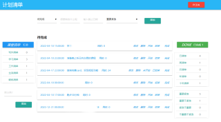
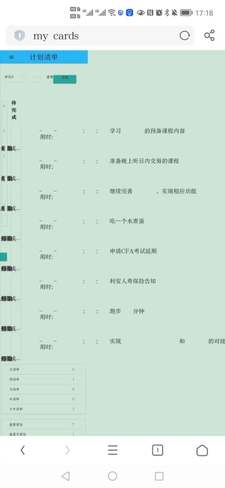
运行结果及报错内容
在电脑上和手机上的效果分别如下:
我的解答思路和尝试过的方法
很明显,html在手机端显示并不正常,百度到了有的方法需要给手机专门做一个网站,感觉略微有点难。还有一种方法是通过调整html实现自适应,可以在手机上也比较好的显示。
我想要达到的结果
想要实现的效果是手机上显示也比较正常,能够正常使用。
解决办法
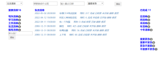
使用了bootstrap重构页面,还比较简陋,但是够用了,后续有时间再优化一下。效果如下:
除了在head中加meta,所有的CSS中的像素都用百分比布局,也就是我们常说的流式布局,这样就可以啦!或者用flex布局也行。以上这种情况大多用于移动端布局。
建议用现成的bootstrap,里面做好了媒体查询,可以适应不同屏幕的页面
要改成响应式的网页,比较麻烦,可能还不如重新用响应式框架写一个。
在头部加入这样的一行代码:
<meta content="width=device-width, initial-scale=1.0, maximum-scale=1.0, user-scalable=0" name="viewport">
每个 img 加个 width="100%"
容器增加css
word-wrap: break-word;
word-break:break-all;
或者使用前端框架呢,如bootstrap,vue等框架都可以使用栅格自动适应
如图情况基本就是没有对手机端尺寸做单独适配的样式。
如果一定要用你自己的样式的话 可以参考下面代码
/* 宽度大于600px小于960之间 */

@media all and (min-width:640px) and (max-width:960px){
 //假如你手机端的屏幕尺寸  样式写这里

}
/* 宽度大于960px小于2000之间 */
@media all and (min-width:960px) and (max-width:2000px){
 //假如你电脑端的屏幕尺寸  样式写这里

}
以此类推,给屏幕分几个尺寸区间然后定义各自的样式, 浏览器样式解析器会根据屏幕尺寸适匹配合适的区间处理,也就是自适应布局
这种h5、pc自适应的网页,后端没有seo需求,还是交给专业的ui框架来做吧,都很成熟了 没必要自己再写一套
最好就是单独再写一个手机端的页面,打开网站的时候,检查一下是移动端还是pc端,打开对应的页面
你这个pc端的页面它不是改一下百分比尺寸加一两行代码啥的就行的,你看你手机都是竖屏的,你的布局都要改,并且字体大小布局宽高等要用rem来适配
重要的是什么呢?你的布局要改,你看你pc端的页面,试想就算页面等比例缩放,你在手机上它能给你挤成什么样?
如果你想要将就着能看就行,那我给你点建议,最起码这三块你要让它竖着排,你可以使用媒体查询,让它们在小屏时换个行,最左边那块使用flex让它们横排,这样感觉将就着能看

上面这行使用flex让它俩靠边,第二行不知道你是用的定位还是啥,试试用margin:auto;给它居中

这个暂时没有方式直接让你整个页面适配的,首先需要你页面的布局和装扮的时候使用百分比的方式,定位方式也要使用相对定位,这样才能根据浏览器展示区域自动调整元素大小和位置。
但是很明显一般平台累的网页并不适合在手机端显示,因为列一般非常的多,会比较丑
这个建议用饿了么的Ui的栏删式布局,可以适应手机端和pc端,单位用rem换算一下,宽度尽量使用百分比,配合meta查询都可以搞定
自适应可以通过js切换网页样式,也可以通过css3,同时还可以通过后端语言来控制,方法有很多种。用css来解决这个问题可以用下面的这个代码片段。
        /* css注释:设置了浏览器宽度不小于1201px时*/
        @media screen and (max-width: 1200px) {

        }

        /* 设置了浏览器宽度不大于1200px时  */
        @media screen and (max-width: 901px) {

        }

        /* 设置了浏览器宽度不大于901px时*/
        @media screen and (max-width: 500px) {

        }
在电脑上显示的页面,完全搬运到手机端时不太合理,得重新设计一下手机端页面显示的布局,写俩套样式,当页面是手机端时使用手机端对应的样式就行。现在就相当于是缺少手机端显示的样式
加上这个
<meta name="viewport" content="width=device-width,initial-scale=1.0, minimum-scale=1.0, maximum-scale=1.0, user-scalable=no"/>
浏览器可以调成手机的尺寸调试代码,没具体的样式我无法调试
如果是html手机自适应代码,用我这个就行了
卧槽是不是最近的html自适应都会出现问题啊?网站容易崩…BUG感觉挺多的可以采用Bootstrap 是最受欢迎的 HTML、CSS 和 JS 框架,用于开发响应式布局、移动设备优先的 WEB 项目。
官网https://www.bootcss.com/
题主你这种情况不太好办,因为你标签中都是直接作用的类名,而类名中的样式列表也没有看到,即使看到的话通过样式改成自适应的也会比较麻烦,你可以尝试上面答主的办法在网页浏览器识别的时候去做处理,应该也达不到你想要的效果,毕竟不知道你的类名对应的样式列表中是何等样式
用bootstrap
不关自适应的事,每个手机大小和分辨率不一样。
width全部加上长度,或者100%,然后就是div居中,剩下没啥了
能贴出来CSS嘛
1.如果你不想引入任何第三方样式,你可以用@media来针对不同的媒体类型定义不同的样式,具体的还有其他
参考

// 手机端
@media screen and (max-width: 768px) {
    body {
        background-color:lightblue;
    }
    .navbar{
      xxx
    }
}
// PC端
@media screen and (max-width:1600px) {

}
2.写两个页面,使用js来获取当前设备类型是PC还是Mobile,来进行切换渲染。但是本质上也是写两套样式,所以还不如用上面那个方法。
3.使用框架来重写一遍,如element-ui,ant-design,这些也都很方便的。

 https://element.eleme.cn/#/zh-CN/component/layout
如果给您提供思路的话请采纳。
响应式就是伪命题 还是老老实实写2套方案吧
适配有很多办法,可以基于容器布局,可以使用rem进行布局参考淘宝
推荐Pywebio