css的平移怎样写在动画里面?
比如以下写法,但是没效果:
.anmin1{
      background:pink;
      animation:image1 infinite 2s;
      }
@keyframes image1{
      0%{translateX(0)}
      100%{translateX(-100px)}
      }
transform: translateX(0);
<!--
* @Author: your name
* @Date: 2021-12-30 16:59:23
* @LastEditTime: 2022-01-18 15:00:13
* @LastEditors: Please set LastEditors
* @Description: 打开koroFileHeader查看配置 进行设置: https://github.com/OBKoro1/koro1FileHeader/wiki/%E9%85%8D%E7%BD%AE
* @FilePath: /未命名文件夹/123.html
-->
<!DOCTYPE html>
<html>
<head>
<meta charset="utf-8" />
<title>菜鸟教程(runoob.com)</title>
<style>
div {
width: 100px;
height: 100px;
background: red;
animation: myfirst infinite 5s;
}
@keyframes myfirst {
0% {
transform: translateX(0);
}
100% {
transform: translateX(100px);
}
}
</style>
</head>
<body>
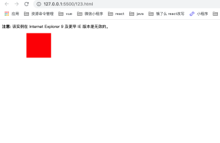
<p><b>注意:</b> 该实例在 Internet Explorer 9 及更早 IE 版本是无效的。</p>
<div></div>
</body>
</html>
少了个transform
@keyframes image1{
      0%{transform: translateX(0)}
      100%{transform: translateX(-100px)}
}