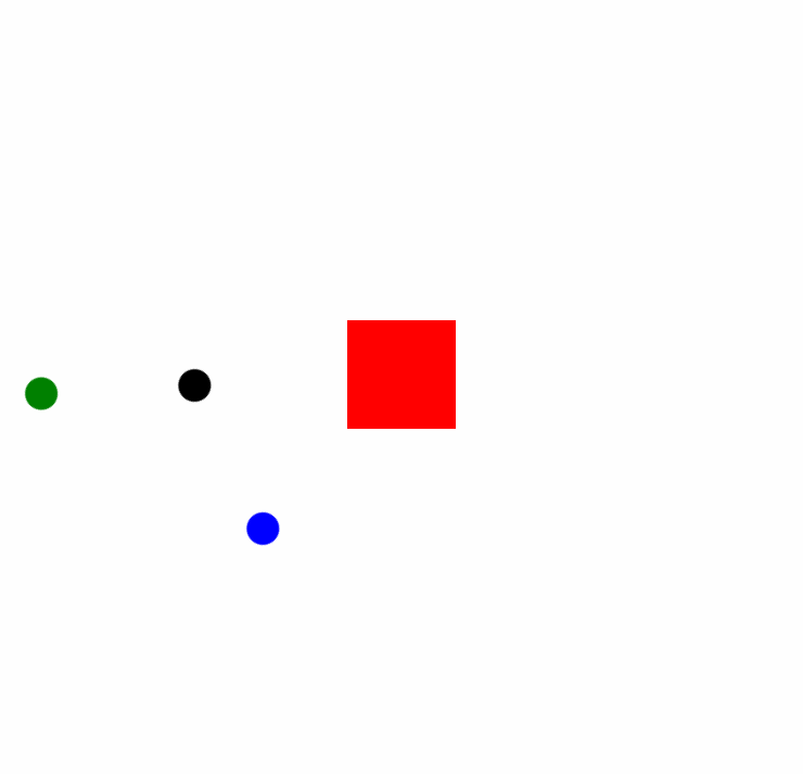
html动画-怎么让图中三个小元素围着大元素公转
这样?题主自行替换下ball为图片,设置图片的大小
<style>
    div.rotate>div{position:absolute;}
    div.rotate .red{background:#f00;width:100px;height:100px;left:500px;top:300px}
    div.rotate .rotateel{width:300px;height:300px;left:400px;top:200px;animation:rotate 10s linear infinite}
    div.rotate .rotateel .ball{position:absolute;left:0;border-radius:50%;width:30px;height:30px;background:#000}
    div.rotate .blue .ball{background:blue;}
    div.rotate .rotate45{transform:rotate(-45deg);width:100%;height:100%}
    div.rotate .green{width:500px;height:500px;left:300px;top:100px}
    div.rotate .green .ball{background:green;}

    @keyframes rotate{
      0%{-webkit-transform:rotate(0deg);}
      25%{-webkit-transform:rotate(90deg);}
      50%{-webkit-transform:rotate(180deg);}
      75%{-webkit-transform:rotate(270deg);}
      100%{-webkit-transform:rotate(360deg);}
    }
</style>
<div class="rotate">
    <div class="rotateel">
        <div class="ball"></div>
    </div>
    <div class="rotateel blue">
        <div class="rotate45">
            <div class="ball"></div>
        </div>
    </div>
    <div class="rotateel green">
        <div class="ball"></div>
    </div>
    <div class="red"></div>
</div>
有帮助麻烦点下【采纳该答案】
https://blog.csdn.net/weixin_39726873/article/details/117720612?utm_source=app&app_version=4.10.0