同程旅游的这两个表单怎么做到在一个盒子里。
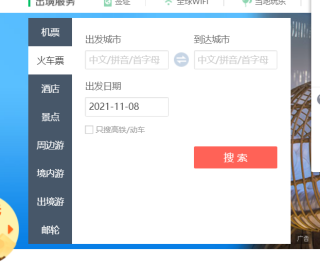
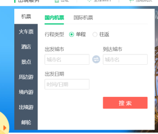
同程官网的这个表单页面怎么做,最好有代码。我想要的效果就是同程l旅游官网的效果。最好一样
tab栏选项卡去做
<!DOCTYPE html>
<html>
    <head>
        <meta charset="utf-8">
        <title></title>
        <style>
            *{
                padding: 0px;
                margin: 0px;
            }
            input{
                display: none;
            }

            .tab1,.tab2,.tab3{
                display: none;
            }

            #t1:checked ~ .tab1{
                display: block !important;
            }
            #t1:checked ~ ul li label[for="t1"]{
                background-color: #d9d9d9;
            }
            #t2:checked ~ .tab2{
                display: block !important;
            }
            #t2:checked ~ ul li label[for="t2"]{
                background-color: #d9d9d9;
            }
            #t3:checked ~ .tab3{
                display: block !important;
            }
            #t3:checked ~ ul li label[for="t3"]{
                background-color: #d9d9d9;
            }
            li{
                list-style-type: none;
                width: 100%;
                background-color: aqua;
                padding: 0px 0px;
                text-align: center;
                border-top: #989898 1px solid;
                border-bottom: #989898 1px solid;
                margin-top: -1px;
                cursor: pointer;
            }
            li label{
                padding: 10px 0px;
                width: 100%;
                height: 100%;
                cursor: pointer;
                display: inline-block;
            }

            li label:hover{
                color: red;
            }

        </style>
    </head>
    <body>

        <div style="padding: 0px;margin: 0px !important;width: 300px;height: 300px;background-color: #d9d9d9">

            <input type="radio" name="tab" id="t1" checked/>
            <input type="radio" name="tab" id="t2" />
            <input type="radio" name="tab" id="t3" />

            <ul style="width: 100px;height: 100%;background-color: #00FFFF;float: left;">
                <li>
                    <label for="t1">asd</label>
                </li>
                <li>
                    <label for="t2">asd</label>
                </li>
                <li>
                    <label for="t3">asd</label>
                </li>
            </ul>

            <div class="tab1">1</div>
            <div class="tab2">2</div>
            <div class="tab3">3</div>

        </div>

    </body>
</html>
有用的话还请采纳!
网上搜一下tab选项卡,一堆教程和代码,同样form表单也是一样,日期的话得用插件了