一个css和html的布局 高度自适应
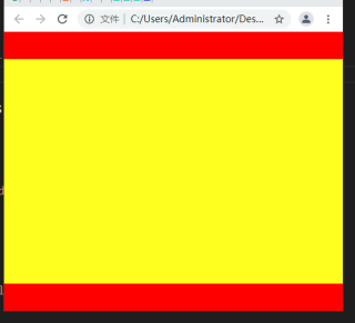
正常情况
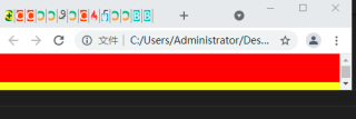
有问题的情况
请问我缩小高度时,如何让这个黄色盒子高度正常,就 是当浏览器高度缩小到一定时候时,这个高度就不能缩小
<!DOCTYPE html>
<html lang="en">

<head>
  <meta charset="UTF-8">
  <meta http-equiv="X-UA-Compatible" content="IE=edge">
  <meta name="viewport" content="width=device-width, initial-scale=1.0">
  <title>Document</title>
  <style>
    body {
      margin: 0;
      /* 需要配合margin: 0;才能使height: 100vh;生效 */
    }

    #divall {
      width: 100%;
      height: 100vh;
      /*  box-sizing: border-box; */
      min-height: 100px;
      display: flex;
      flex-direction: column;
    }

    .div1 {
      height: 40px;
      background-color: red;
    }

    .div2 {
      flex: 1;
      /*  height: 100vh; */
      background-color: yellow;

    }
  </style>
</head>

<body>
  <div id="divall">
    <div class="div1"></div>
    <div class="div2"></div>
    <div class="div1"></div>
  </div>
  <script></script>
</body>

</html>
总之不能出现上面这种滚动条
使用js代码控制,浏览器缩小到一定的高度之后,禁止缩小
$(window).resize(function(){
  if(document.body.clientHeight<700){
  alert(“禁止缩放”);
  window.resizeTo(document.body.clientHeight,300);
  }
}); //宽度同理
min-height
max-width
min-width
max-height
min-height
我用了min-height,还是不对啊,会出现那个滚动条

<!DOCTYPE html>
<html lang="en">

<head>
  <meta charset="UTF-8">
  <meta http-equiv="X-UA-Compatible" content="IE=edge">
  <meta name="viewport" content="width=device-width, initial-scale=1.0">
  <title>Document</title>
  <style>
    body {
      margin: 0;
      /* 需要配合margin: 0;才能使height: 100vh;生效 */
    }

    #divall {
      width: 50%;
      height: 100vh;
      /*  box-sizing: border-box; */
      min-height: 180px;
      display: flex;
      flex-direction: column;
    }

    .div1 {
      height: 40px;
      background-color: red;

    }

    .div2 {
      flex: 1;
      min-height: 100px;
      /*  height: 100vh; */
      background-color: yellow;
      display: flex;
      justify-content: center;
      align-items: center;
    }

    .cla {
      width: 30px;
      height: 30px;
      background-color: blue;
      display: none;
    }
  </style>
</head>

<body>
  <div id="divall">
    <div class="div1">
    </div>
    <div class="div2">
      <div class="cla">cl</div>
      <div class="cla">cl</div>
      <div class="cla">cl</div>
    </div>
    <div class="div1"></div>
  </div>
  <script>
    let divall = document.getElementById("divall")
    let cla = document.querySelectorAll(".cla")
    var count = 0;
    divall.addEventListener('click', function () {
      count++
      cla.forEach(function (aaa) {
        if (count % 2 === 1) {
          aaa.style.display = 'block'
        } if (count % 2 === 0) {
          aaa.style.display = 'none'
        }// 利用数的累加来实现显示影藏
      })
    })
  </script>
</body>

</html>
就比如像这个宽度

,浏览器缩小到一定宽度后,就不能缩小了