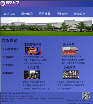
哪位大佬可以帮我用代码表示一下这个图,弄成网页的形式,用div.急用,感谢大佬啦!!!
1。自己切图把图片src填上就行。2.建议自己改一下类名。题外话:今天和昨天看到两三个人都问这个页面,你们不会是同一个班的吧。。。如果是自己改一下类名防止,teacher一眼就看出来是copy的哈哈,经验之谈。但还是建议你自己写,这个就是为了锻炼布局能力。不想写代码的话就不适合这行。
<!DOCTYPE html>
<html lang="en">

<head>
    <meta charset="UTF-8">
    <meta http-equiv="X-UA-Compatible" content="IE=edge">
    <meta name="viewport" content="width=device-width, initial-scale=1.0">
    <title>Document</title>
    <style>
        * {
            margin: 0;
            padding: 0;
        }

        .box {
            width: 100%;
            height: 100vh;
        }

        .navBox {
            width: 100%;
            height: 15%;
        }

        .navBox .logo {
            background: #5F4BA6;
            height: 40%;
            width: 100%;
        }

        .navBox img {
            width: 20%;
            height: 100%;
            /* // border: 1px solid red; */
        }

        .navBox .nav {
            height: 60%;
            width: 100%;
            background: #818AE2;
            position: relative;
        }

        .navBox .nav ul {
            display: flex;
            list-style: none;
            width: 100%;
            position: absolute;
            bottom: 0;
        }

        .navBox .nav ul li {
            width: 10%;
            color: white;
            font-size: 20px;
            text-align: center;
        }

        .contentBox {
            width: 100%;
            height: 70%;
            background: #818AE2;
        }

        .contentBox .banner {
            width: 100%;
            height: 20%;
        }

        .contentBox .banner img {
            width: 100%;
            height: 100%;
        }

        .content {
            width: 100%;
            height: 80%;
            /* padding: 20px; */
            display: flex;
        }

        .content .left {
            width: 20%;
            height: 100%;
        }

        .content .left ul {
            list-style: none;
        }

        .content .left ul li {
            font-size: 20px;
            width: 100%;
            height: 60px;
            line-height: 60px;
        }

        .content .left ul li:first-child {
            font-size: 25px;
        }

        .content .right {
            width: 80%;
            height: 100%;
            padding-top: 30px;
        }

        .content .right ul {
            list-style: none;
            width: 100%;
            display: flex;
            /* flex-wrap: wrap; */
            height: 100%;
            /* margin-top: 30px; */
            flex-wrap: wrap;
            justify-content: space-around;
        }

        .content .right ul li {
            width: 40%;
            height: 40%;


        }

        .content .right ul li .title {
            font-size: 20px;
        }

        .content .right ul li img {
            width: 120px;
            height: 50px;
            display: block;
        }

        .content .right ul li p {
            width: 145px;
            flex-wrap: wrap;
            display: inline-block;
            overflow: hidden;
            text-overflow: ellipsis;
            cursor: pointer;
            display: -webkit-box;
            -webkit-line-clamp: 3;
            -webkit-box-orient: vertical;
        }

        .footerBox {
            width: 100%;
            height: 15%;
            background: #6540A1;
            /* display: flex; */
            position: relative;
        }

        .footerBox p {
            font-size: 12px;
            height: 25px;
            line-height: 25px;
            width: 80%;
        }
        .footerBox .erweimaBox{
            position: absolute;
            right: 10px;
            top: 10px;
            width: auto;
        }
        .footerBox .erweimaBox .erweima {
            width: 50px;
            height: 50px;
        }

        .footerBox .erweimaBox .erweima img {
            width: 100%;
            height: 100%;
        }
        .footerBox .erweimaBox p{
             width: 40px;
        }
        .footerBox .beian{
            position: absolute;
            top: 56px;
            right: 35px;
        }
        .footerBox .beian p{
            width: auto;
        }
    </style>
</head>

<body>
    <div class="box">
        <div class="navBox">
            <div class="logo">
                <img src="" alt="">
            </div>
            <div class="nav">
                <ul>
                    <li>走进庆华</li>
                    <li>走进庆华</li>
                    <li>走进庆华</li>
                    <li>走进庆华</li>
                </ul>
            </div>
        </div>
        <div class="contentBox">
            <div class="banner">
                <img src="" alt="" sizes="" srcset="">
            </div>
            <div class="content">
                <div class="left">
                    <ul>
                        <li>院系设置</li>
                        <li>院系设置</li>
                        <li>院系设置</li>
                        <li>院系设置</li>
                        <li>院系设置</li>
                    </ul>
                </div>
                <div class="right">
                    <ul>
                        <li>
                            <span class="title">工商管理学院</span>
                            <img src="" alt="">
                            <p>工商管理学院坚持育人之本,工商管理学院坚持育人之本,工商管理学院坚持育人之本</p>
                        </li>
                        <li>
                            <span class="title">工商管理学院</span>
                            <img src="" alt="">
                            <p>工商管理学院坚持育人之本,工商管理学院坚持育人之本,工商管理学院坚持育人之本</p>
                        </li>
                        <li>
                            <span class="title">工商管理学院</span>
                            <img src="" alt="">
                            <p>工商管理学院坚持育人之本,工商管理学院坚持育人之本,工商管理学院坚持育人之本</p>
                        </li>
                        <li>
                            <span class="title">工商管理学院</span>
                            <img src="" alt="">
                            <p>工商管理学院坚持育人之本,工商管理学院坚持育人之本,工商管理学院坚持育人之本</p>
                        </li>
                    </ul>
                </div>
            </div>
        </div>
        <div class="footerBox">
            <p>学院地址:四川省</p>
            <p>学院地址:四川省</p>
            <p>学院地址:四川省</p>
            <p>学院地址:四川省</p>
            <div class="erweimaBox">
                <div class="erweima">
                    <img src="" alt="">
                </div>
            </div>
            <div class="beian">
                <p>网站备案:9999999999999</p>
                <p>网站备案</p>
            </div>

        </div>
    </div>
</body>
<script>
</script>
</html>
作业要自己做,这么大的页面,怕不是得写一个小时
楼上正解,这就是为了巩固html和css布局。总是让别人给写,自己什么也不会。没啥用
没有什么是钱解决不了的。