用python作答 雷达图的绘制

import numpy as np
import matplotlib.pyplot as plt
# 用于正常显示中文
plt.rcParams['font.sans-serif'] = 'SimHei'
#用于正常显示符号
plt.rcParams['axes.unicode_minus'] = False
plt.style.use('ggplot')
# 构造数据
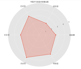
values = [2.6,2.1,3.4,3,4.1,3.5]
feature = ['现实型','研究型','艺术型','社会型','企业型','常规型']
# 设置每个数据点的显示位置,在雷达图上用角度表示
angles=np.linspace(0, 2*np.pi,len(feature), endpoint=False)
# 拼接数据首尾,使图形中线条封闭
values=np.concatenate((values,[values[0]]))
angles=np.concatenate((angles,[angles[0]]))
feature=np.concatenate((feature,[feature[0]])) #对labels进行封闭
# 绘图
fig=plt.figure()
# 设置为极坐标格式
ax = fig.add_subplot(111, polar=True)
# 绘制折线图
ax.plot(angles, values, 'o-', linewidth=2)
# 填充颜色
ax.fill(angles, values, alpha=0.25)
# 设置图标上的角度划分刻度,为每个数据点处添加标签
ax.set_thetagrids(angles * 180/np.pi, feature)
# 设置雷达图的范围
ax.set_ylim(0,5)
# 添加标题
plt.title('中国乒乓球选手的雷达图')
# 添加网格线
ax.grid(True)运行结果: