Python怎样画折线图
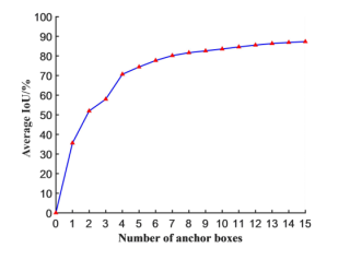
如何使用Python,画出类似下图所示的折线图
根据你的问题,下面专门为你解答,可直接运行下面代码:
import matplotlib.pyplot as plt

# 设置图框的大小
fig = plt.figure(figsize=(10,6))

x = [0,1, 2, 3,4,5,6,7,8,9,10]
y = [0,25,40,50,58,65,71,76,80,82,88]

# 绘图
plt.plot(x, # x轴数据
         y, # y轴数据
         linestyle = '-', # 折线类型
         linewidth = 2, # 折线宽度
         color = 'steelblue', # 折线颜色
         marker = '*', # 点的形状
         markersize = 6, # 点的大小
         markeredgecolor='black', # 点的边框色
         markerfacecolor='green') # 点的填充色

# 添加标题和坐标轴标签
plt.xlabel('Number of anchor boxes')
plt.ylabel('Average IoU/%')
plt.show()
可以用matplotlib,可参考https://blog.csdn.net/cc__cc__/article/details/105793786?spm=1001.2014.3001.5502
试试这个代码。
>>> import numpy as np
>>> import matplotlib.pyplot as plt
>>> x = np.arange(16)
>>> y = np.power(x/100, 1/4) * 100
>>> plt.plot(x, y, marker='^', mfc='red')
[<matplotlib.lines.Line2D object at 0x0000026174ED0CC8>]
>>> plt.xlabel('Number of anchor boxes')
Text(0.5, 0, 'Number of anchor boxes')
>>> plt.ylabel('Average IoU/%')
Text(0, 0.5, 'Average IoU/%')
>>> plt.show()

提供两种方法, 一种用pandas 一种用pandas-bokeh
# 方法一
import numpy as np
import pandas as pd
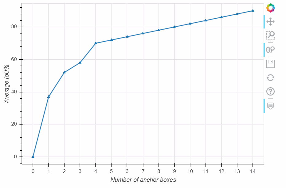
data = pd.DataFrame([0,37,52,58,70,72,74,76,78,80,82,84,86,88,90],columns=['值'])
data.plot(figsize=(12,8), # 图表大小
xlim=(0,15), # x轴范围
ylim=(0,100), # y轴范围
yticks=range(0,110,10), #y轴间隔
xticks=range(0,16,1), # x轴间隔
xlabel='Number of anchor boxes', #x轴名称
ylabel='Average IoU%', # y轴名称
marker='^', # 标记
legend=None, # 不显示图例
mfc='red', #标记颜色
)
# 方法二
import numpy as np
import pandas as pd
import pandas_bokeh
data = pd.DataFrame([0,37,52,58,70,72,74,76,78,80,82,84,86,88,90],columns=['值'])
data[['值']].plot_bokeh(xlabel='Number of anchor boxes',
ylabel='Average IoU%',
plot_data_points=True,
legend=None, # 不显示图例
marker='^', # 标记
)
可参考: