求大神指点div布局顺序问题
这是一个div布局,中部自适应的代码
下面是第一次的div布局顺序代码
<!doctype html>
<html>
<head>
<meta charset="utf-8">
<title>无标题文档</title>
<style>
	.one{
		width:75px;
		height:100px;
		background-color:#F60;
		float:left;
		margin-top:0px;
		margin-left:0px;
	}
	.two{
		height:100px;
		background-color:#F00;
		margin-left:75px;
		margin-right:75px;
	}
	.three{
	width: 75px;
	height: 100px;
	background-color: #FC0;
	float: right;
	margin-top:0px;
	margin-right:0px;
	}

</style>
</head>

<body>
<div class="one">this is one</div>
<div class="two">this is three</div>
<div class="three">this is three</div>
</body>
</html>
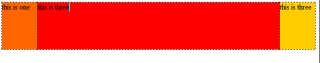
这是运行结果
下面是调整后的代码
<!doctype html>
<html>
<head>
<meta charset="utf-8">
<style>
	.one{
		width:75px;
		height:100px;
		background-color:#F60;
		float:left;
		margin-top:0px;
		margin-left:0px;
	}
	.two{
		height:100px;
		background-color:#F00;
		margin-left:75px;
		margin-right:75px;
	}
	.three{
	width: 75px;
	height: 100px;
	background-color: #FC0;
	float: right;
	margin-top:0px;
	margin-right:0px;
	}

</style>
</head>

<body>
<div class="one">this is one</div>
<div class="three">this is three</div>
<div class="two">this is three</div>
</body>
</html>
运行如下
求大神讲解一下!!!
当div的顺序是第一种时:
<div class="one">this is one</div>
<div class="two">this is three</div>
<div class="three">this is three</div>
one是浮动的情况,`float`是不完全脱离文档流,此时还是会占据one的宽度;
two是正常的情况,此时他有margin,margin是从one占据的位置开始的,即你可以想象此时one在two的margin-left上面,所以由于margin-left + width + margin-right 占据了一整行,所以three只能从第二行开始了。
当div的顺序是第二种时:
<div class="one">this is one</div>
<div class="three">this is three</div>
<div class="two">this is three</div>
one和three都是float 半脱离文档流;two的margin-left在one的下面,margin-right在three的下面。
浮动脱离文档流,会对后面的元素位置产生影响,第一种方法,one不占用原本的位置,所以two直接在第一排,div是块级元素,独占一行,所以three不管浮动还是不浮动,都会另起一行,第二种方法,是one和three都为浮动元素,他们都脱离了文档流,two在one和three之后,所以会在第一行居中,one和three一个左浮动一个又浮动,所以在两边,能出现在同一行
当div的顺序是第一种时:
<div class="one">this is one</div>
<div class="two">this is three</div>
<div class="three">this is three</div>
one是浮动的情况,`float`是不完全脱离文档流,此时还是会占据one的宽度;
感谢!