Python的多重饼图怎么绘制
我想绘制多重饼图,但是网上的教程出了点问题,想请大神帮忙看看是怎么了。
 import matplotlib.pyplot as plt
vals1 = [1, 2, 3, 4]
vals2 = [2, 3, 4, 5]
fig, ax = plt.subplots()
labels = 'A', 'B', 'C', 'D'
colors = ["#34495E","#FFFF01","#0000FE","#FE0000"]
ax.pie(vals1, radius=1.2,autopct='%1.1f%%',pctdistance=0.9,colors=colors)
ax.pie(vals2, radius=1,autopct='%1.1f%%',pctdistance=0.75,colors=colors)
ax.set(aspect="equal", title='Pie plot with `ax.pie`')
#plt.legend()
plt.legend(labels,bbox_to_anchor=(1, 1), loc='best', borderaxespad=0.)
plt.show()
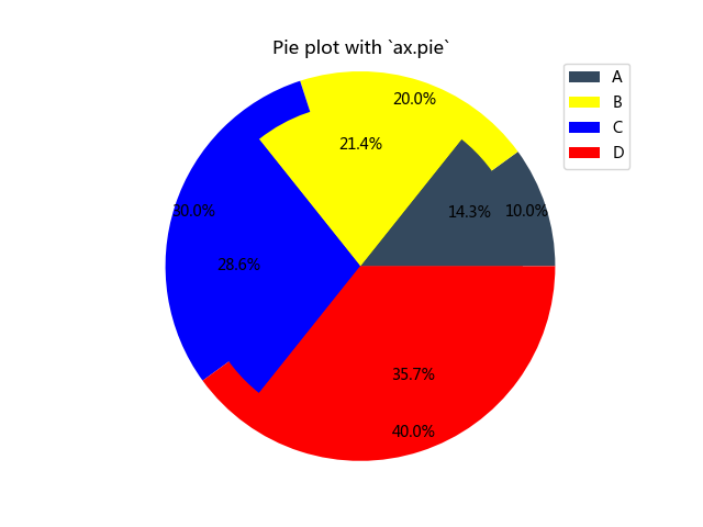
这是运行结果,问题就是这跟网上的教程不一样,颜色混在一起了。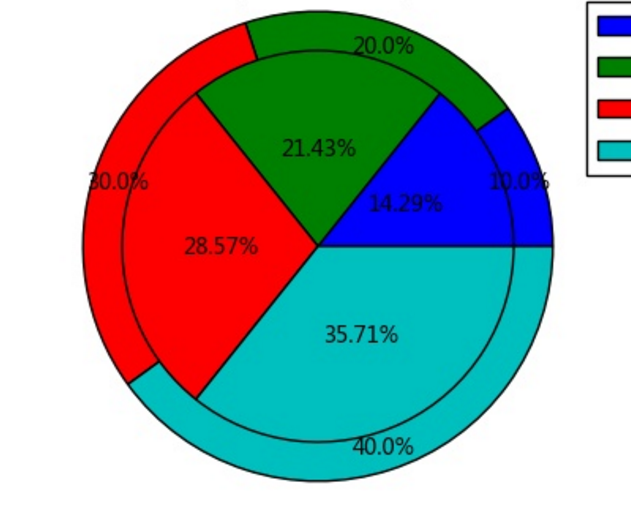
我需要这样的效果,其实就是少了圆外面的分割线,我想问,应该怎么做?
http://bbs.csdn.net/topics/392308532
或者教我用其他库话多重饼图也可以。只要能达到目的就行
http://blog.csdn.net/wizardforcel/article/details/54407212
Matpolylib完整教程
解决了。。。妈的智障,原来是matplotlib版本问题.2.1.1班表被去掉外边框。旧版本有,不知道新版本matplotlib是如何解决多重饼图颜色重叠这个问题。
qq_39699392 用PyCharm就可以了
import matplotlib.pyplot as plt
vals1 = [1, 2, 3, 4]
vals2 = [2, 3, 4, 5]
fig, ax = plt.subplots()
labels = 'A', 'B', 'C', 'D'
colors = ["#34495E","#FFFF01","#9990FE","#FE0000"]
ax.pie(vals1, radius=1.2,autopct='%1.1f%%',pctdistance=0.9,colors=colors)
ax.pie(vals2, radius=1,autopct='%1.1f%%',pctdistance=0.75,colors=colors)
ax.set(aspect="equal", title='Pie plot with ax.pie')!
plt.legend(labels,bbox_to_anchor=(1, 1), loc='best', borderaxespad=0.)
plt.show()
qq_39699392 这段程序没问题,用PyCharm就可以了(python3.5 matplotlib1.5.3)
import numpy as np
import pandas as pd
import matplotlib.pyplot as plt
loandata=pd.DataFrame(pd.read_excel('r.xlsx'))
loan_grade5=loandata.groupby('A')['Q'].agg(sum)
loan_grade4=loandata.groupby('A')['CP'].agg(sum)
loan_grade3=loandata.groupby('A')['CK'].agg(sum)
fig,ax = plt.subplots()
colors = ['yellowgreen', 'gold', 'lightskyblue', 'lightcoral']
name=[u'东', u'北', u'南', u'西']
ax.legend(name, loc='upper left')
ax.pie(loan_grade4,explode=(0, 0, 0, 0),startangle=60,autopct='%1.3f%%',radius=1.4,pctdistance = 1.0,colors=colors)
#创建饼图,设置分类标签,颜色和图表起始位置等
ax.pie(loan_grade5,explode=(0, 0, 0, 0),startangle=60,autopct='%1.3f%%',radius=1.2,pctdistance = 0.9,colors=colors)
#创建饼图,设置分类标签,颜色和图表起始位置等
ax.pie(loan_grade3,explode=(0, 0, 0, 0),startangle=60,autopct='%1.3f%%',radius=0.9,pctdistance = 0.7,colors=colors)
ax.set(aspect="equal", title='多重饼图')
#显示图表
plt.show()
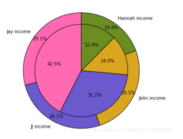 我画出分割线啦,https://blog.csdn.net/weixin_40683253/article/details/87814046