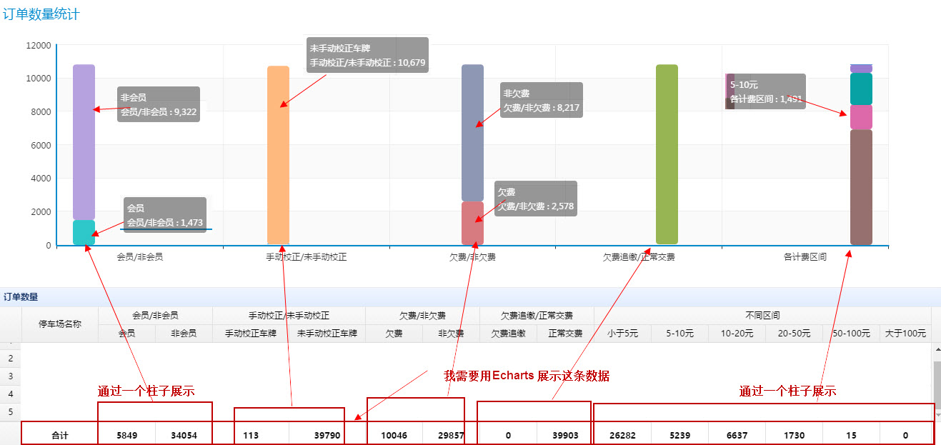
Echarts 使用,遇到一个需求不知道如何展示数据,如图所示:
把数据封装成json报文,至于不同柱子你可以参考demo
写入不同的json对象,按需求把你的数据归类然后封装这是首要的
http://echarts.baidu.com/echarts2/doc/example.html
参考一下百度的例子,
可以参考他们的例子慢慢改,
看了下,下面这个有点像你的需求:
http://echarts.baidu.com/echarts2/doc/example/bar12.html
我只列举了前几个的分类的写法,后面的写法类似,以下是echarts里的option定义以及效果图,看符合你的需求吗,另外这个例子的tooltip有些问题,可以自己添加自定义函数进行修改
 option = {
    tooltip : {
        trigger: 'axis',
        axisPointer : {            // 坐标轴指示器,坐标轴触发有效
            type : 'shadow'        // 默认为直线,可选为:'line' | 'shadow'
        }
    },
    legend: {
        data:['会员','非会员','手动校正','未手动校正','欠费','非欠费','欠费追缴','正常缴费','小于5元','5-10元','10-20元','20-50元','50-100元','大于100元']
    },
    toolbox: {
        show : true,
        orient: 'vertical',
        x: 'right',
        y: 'center',
        feature : {
            mark : {show: true},
            dataView : {show: true, readOnly: false},
            magicType : {show: true, type: ['line', 'bar', 'stack', 'tiled']},
            restore : {show: true},
            saveAsImage : {show: true}
        }
    },
    calculable : true,
    xAxis : [
        {
            type : 'category',
            data : ['会员/非会员','手动校正/未手动校正','欠费/非欠费','欠费追缴/正常缴费','各计费区间']
        }
    ],
    yAxis : [
        {
            type : 'value'
        }
    ],
    series : [
        {
            name:'会员',
            type:'bar',
            stack: '广告',
            data:[5849, 0, 0, 0, 0, 0, 0]
        },
        {
            name:'非会员',
            type:'bar',
            stack: '广告',
            data:[34054, 0, 0, 0, 0, 0, 0]
        },
        {
            name:'手动校正',
            type:'bar',
            stack: '广告',
            data:[0, 113, 0, 0, 0, 0, 0]
        },
        {
            name:'非手动校正',
            type:'bar',
            stack: '广告',
            data:[0, 39790, 0, 0, 0, 0, 0]
        },
        {
            name:'欠费',
            type:'bar',
            stack: '广告',
            data:[0, 0, 10046, 0, 0, 0, 0]
        },
        {
            name:'非欠费',
            type:'bar',
            stack: '广告',
            data:[0, 0, 29857, 0, 0, 0, 0]
        }
    ]
};
