PCA第二主成分坐标为什么相反(R包mixOmics和python包sklearn)
本人用python生成了一个包含40个样本三个Feature的数据集,同时用python中的sklearn作图,并导出数据集用R包的mixOmics作图。
发现第二主成分坐标相反,本人并不十分熟悉PCA矩阵计算过程,所以将详细步骤放上来,寻求大神解答。
Python作图过程及数据集产生:
import numpy as np
import pandas as pd
import matplotlib.pyplot as plt
np.random.seed(3) # random seed for consistency

#数据集生成
mu_vec1 = np.array([0,0,0])
cov_mat1 = np.array([[1,0,0],[0,1,0],[0,0,1]])
class1_sample = np.random.multivariate_normal(mu_vec1, cov_mat1, 20).T
assert class1_sample.shape == (3,20), "The matrix has not the dimensions 3x20"

mu_vec2 = np.array([1,1,1])
cov_mat2 = np.array([[1,0,0],[0,1,0],[0,0,1]])
class2_sample = np.random.multivariate_normal(mu_vec2, cov_mat2, 20).T
assert class2_sample.shape == (3,20), "The matrix has not the dimensions 3x20"
all_samples = np.concatenate((class1_sample, class2_sample), axis=1)

# 数据集导出用于R作图
all_samples_to_df = pd.DataFrame(data=all_samples)
all_samples_to_df.to_csv('all_samples.csv',index=False)

# 数据集sklearn作图PCA
from sklearn.decomposition import PCA as sklearnPCA

sklearn_pca = sklearnPCA(n_components=2)
sklearn_transf = sklearn_pca.fit_transform(all_samples.T)

plt.plot(sklearn_transf[0:20,0],sklearn_transf[0:20,1], 'o', markersize=7, color='blue', alpha=0.5, label='class1')
plt.plot(sklearn_transf[20:40,0], sklearn_transf[20:40,1], '^', markersize=7, color='red', alpha=0.5, label='class2')

plt.xlabel('x_values')
plt.ylabel('y_values')
plt.xlim([-3.05,3.5])
plt.ylim([2.5,-2.3])
plt.legend()
plt.title('Transformed samples with class labels from matplotlib.mlab.PCA()')

plt.show()
Python结果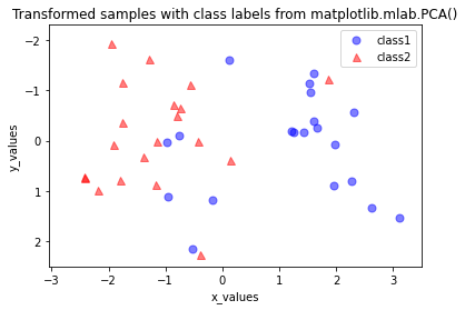
R语言作图
library(mixOmics)
library(ggplot2)


setwd('S:\\')
getwd()

all_samples_to_df <- read.csv('all_samples.csv')


PCA.proteins = as.matrix(all_samples_to_df)
PCA.proteins = t(PCA.proteins)

#define PCA.class
#therefore your treatments are used
PCA.class = c(1,1,1,1,1,1,1,1,1,1,
              1,1,1,1,1,1,1,1,1,1,
              2,2,2,2,2,2,2,2,2,2,
              2,2,2,2,2,2,2,2,2,2)


PCA.PCA = mixOmics::pca(PCA.proteins, ncomp = 2)

plot(PCA.PCA)


PCA_ggplot = as.data.frame(PCA.PCA$x)
PCA_ggplot = PCA_ggplot[, 1:2]
PCA_ggplot$Class = PCA.class

minPC1 = round_any(min(PCA_ggplot$PC1), 20, f = floor)
maxPC1 = round_any(max(PCA_ggplot$PC1), 20, f = ceiling)
minPC2 = round_any(min(PCA_ggplot$PC2), 20, f = floor)
maxPC2 = round_any(max(PCA_ggplot$PC2), 20, f = ceiling)

plotname = paste("PCA_proteins_ggplot", ".pdf", sep = "")
filename = paste(plots_dir, plotname, sep = dirsep)

pdf(
  file = filename,
  width = 6.5,
  height = 5,
  pointsize = 12
)

gg = ggplot(PCA_ggplot, aes(x = PC1, y = PC2, color = Class)) +
  geom_point(size = 3) +
  scale_color_npg() +
  stat_ellipse(level = 0.8) +
  scale_x_continuous(expand = c(0,0), limits = c(minPC1, maxPC1)) +
  scale_y_continuous(expand = c(0,0), limits = c(minPC2, maxPC2)) +
  theme_classic() +
  theme(axis.title.y = element_text(size = rel(1), color = "black", face = "plain"),
        axis.title.x = element_text(size = rel(1), color = "black", face = "plain"),
        axis.text.x = element_text(size = rel(1), color = "black", face = "plain"),
        axis.text.y = element_text(size = rel(1), color = "black", hjust = 1, face = "plain"),
        axis.line = element_line(colour = "black", size = 0.5),
        axis.ticks = element_line(colour = "black", size = 0.5),
        legend.title = element_text(size = rel(1), face = "bold", color = "black"),
        panel.spacing = unit(0.5, "cm"),
        plot.margin = margin(t = 0.5, r = 0.5, b = 0.5, l = 0.5, "cm"),
        #panel.border = element_rect(colour = "black", fill=NA, size=1),
        plot.title = element_text(size = rel(1), face = "bold",
                                  color = "black", hjust = 0.5)) +
  ylab(paste("PC2: ", round(PCA.PCA$explained_variance[[2]]*100, digits = 0),
             " % explained variance", sep = "")) +
  xlab(paste("PC1: ", round(PCA.PCA$explained_variance[[1]]*100, digits = 0),
             " % explained variance", sep = "")) +
  labs(color = "Treatment")
gg

print(gg)

dev.off()

#2D Score plot
mixOmics::plotIndiv(
  PCA.PCA,
  comp = c(1, 2),
  ind.names = TRUE,
  #wenn T, dann kein Zeichen (pch)
  #pch = 16,  #bestimmt Form - in diesem Fall gef?llter Kreis
  #col.per.group = PCA.col,
  group = PCA.class,
  legend = FALSE,
  ellipse = FALSE,
  #ellipse.level = 0.75,
  title = "PCA",
  star = FALSE,
  style = "graphics"
)
pI = mixOmics::plotIndiv(
  PCA.PCA,
  comp = c(1, 2),
  ind.names = FALSE,
  point.lwd = 1,
  pch = 19,
  legend.bty = "n",
  #wenn T, dann kein Zeichen (pch)
  #pch = 16,  #bestimmt Form - in diesem Fall gef?llter Kreis
  col.per.group = ggsci::pal_npg(palette = "nrc")(length(unique(PCA.class))),
  group = PCA.class,
  legend = TRUE,
  legend.position = "right",
  size.legend.title = rel(1),
  size.legend = rel(1),
  ellipse = TRUE,
  ellipse.level = 0.75,
  title = "PCA",
  star = FALSE,
  style = "graphics"
)
r作图结果: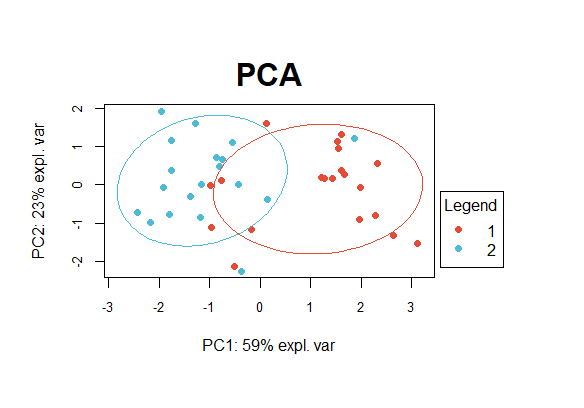
其他主要作图细节说明:
版本:
- R语言:3.6.1
- Python: 3.8.3 如需更多细节,欢迎留言,看到即回复。