echarts 线柱图,正负差值大,柱子显示不全问题
请问大神,下图中,正负数差值较大,导致数值较小柱子看不到了,请问是否有别的方法,让数值较大的柱子不要那么高,也能直观展示出效果。
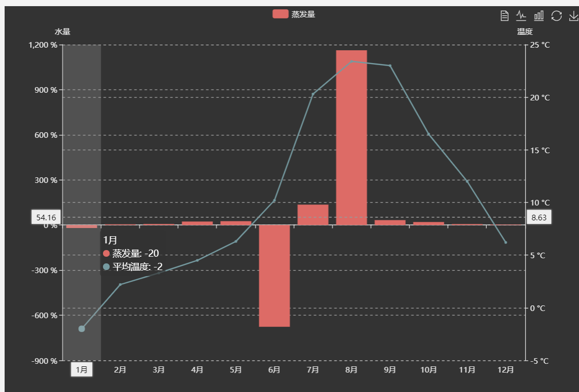
源代码链接:[(https://gallery.echartsjs.com/editor.html?c=x3ywCBPxMV "")]
option = {
    tooltip: {
        trigger: 'axis',
        axisPointer: {
            type: 'cross',
            crossStyle: {
                color: '#999'
            }
        }
    },
    toolbox: {
        feature: {
            dataView: {show: true, readOnly: false},
            magicType: {show: true, type: ['line', 'bar']},
            restore: {show: true},
            saveAsImage: {show: true}
        }
    },
    legend: {
        data: ['蒸发量']
    },
    xAxis: [
        {
            type: 'category',
            data: ['1月', '2月', '3月', '4月', '5月', '6月', '7月', '8月', '9月', '10月', '11月', '12月'],
            axisPointer: {
                type: 'shadow'
            }
        }
    ],
    yAxis: [
        {
            type: 'value',
            name: '水量',


            axisLabel: {
                formatter: '{value} %'
            }
        },
        {
            type: 'value',
            name: '温度',

            interval: 5,
            axisLabel: {
                formatter: '{value} °C'
            }
        }
    ],
    series: [
        {
            name: '蒸发量',
            type: 'bar',
            data: [-20.0, 4.9, 7.0, 23.2, 25.6, -676.7, 135.6, 1162.2, 32.6, 20.0, 6.4, 3.3]
        },

        {
            name: '平均温度',
            type: 'line',
            yAxisIndex: 1,
            data: [-2.0, 2.2, 3.3, 4.5, 6.3, 10.2, 20.3, 23.4, 23.0, 16.5, 12.0, 6.2]
        }
    ]
};
限制最大最小值。。。
就这样呗,如果限制了里面的某些数据,那么你这柱形图和折线图就走样了。那为什么还要用这种方式显示呢?
你其实可以在这些柱子和折点上显示蒸发量、温度的数值