Bootstrap可防止多个可折叠元素同时打开
I have the following html sidebar menu:
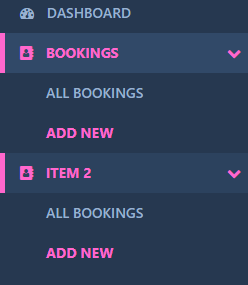
<li {{{ (Request::is('bookings/*') }}} data-toggle="collapse" data-target="#bookings">
    <a href="#" id="bookings-menu-item"><i class="fa fa-address-book" aria-hidden="true"></i> Bookings <i class="fa fa-chevron-down" aria-hidden="true"></i></a>
</li>
<ul class="sub-menu collapse"  id="bookings">
    <li class="collapsed"><a href="{{ route('bookings') }}">All Bookings</a></li>
    <li class="collapsed" ><a href="{{ route('bookings.create') }}">Add New</a></li>
</ul>

<li {{{ (Request::is('bookings/*') || Request::is('bookings') ? 'class=active' : '') }}} data-toggle="collapse" data-target="#item2">
   <a href="#" id="bookings-menu-item"><i class="fa fa-address-book" aria-hidden="true"></i> Item 2 <i class="fa fa-chevron-down" aria-hidden="true"></i></a>
</li>
<ul class="sub-menu collapse"  id="item2">
    <li {{{ (Request::is('bookings') ? 'class=active' : 'collapsed') }}}><a href="{{ route('bookings') }}">All Bookings</a></li>
    <li {{{ (Request::is('bookings/create') ? 'class=active' : 'collapsed') }}} ><a href="{{ route('bookings.create') }}">Add New</a></li>
</ul>
This is a basic Bootstrap collapse menu that contains a sub menu which expands when the li element is clicked.
The problem I have is lets say I have 2 or 3 of these menu items that all have sub menus. There is a possibility that all of them could open at the same time, I don't like this because this forces a scroll overflow as the height increases which then shows a scrollbar for the side menu.
Is there a way I can prevent multiple elements from being expanded in Bootstrap?
I am using Laravel 5 if that helps.
I think this should help you, just play a little with it to adapt it to your needs:
<div class="row">
    <div class="col">
        <ul class="nav nav-stacked" id="accordion1">
            <li class="panel"> <a data-toggle="collapse" data-parent="#accordion1" href="#firstLink">Test12</a>

                <ul id="firstLink" class="collapse">
                    <li>SubTest1</li>
                    <li>SubTest1</li>
                    <li>SubTest1</li>
                </ul>

            </li>
            <li class="panel"> <a data-toggle="collapse" data-parent="#accordion1" href="#secondLink">Test2</a>

                <ul id="secondLink" class="collapse">
                    <li>SubTest2</li>
                    <li>SubTest2</li>
                    <li>SubTest2</li>
                    <li>SubTest2</li>
                </ul>
            </li>
        </ul>
    </div>
</div>
See it here