如何调chart折线图中坐标轴与坐标值的间距
坐标轴与坐标值的间距距离太近,数值有点干涉,怎么可以把y轴坐标值向左移动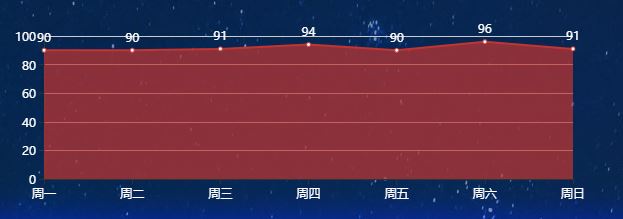
 xAxis : [
        {
            type : 'category',
            boundaryGap : false,
            data : ['周一','周二','周三','周四','周五','周六','周日']
        }
    ],
    yAxis : [
        {
            type : 'value'
        }
    ],

    series : [
        {
            name:'工位评分',
            type:'line',
            stack: '总量',
            areaStyle: {},
            data:[90, 90, 91, 94, 90, 96, 91],
label: {
                  normal: {
                      show: true,
                      position: 'top',
                      textStyle: {
                        color: 'white'
                      }
                  }
             },
        }

    ]
};
去掉 boundaryGap : false, 这个配置,第一个数据就不会重叠在 y 坐标轴线上了。
去掉后你的代码在 Echarts 官网上的运行结果为: