echarts数据折线图不显示,坐标轴内容修改
// 男排世界排名
(function () {


  var myChart = echarts.init(document.querySelector(".line .chart"));

  var option = {
    // 修改折线的颜色
    color: ['#00f2f1', '#ed3f35','#d223e7',,'#12e78c'],
    tooltip: {
      trigger: 'axis'
    },
    // 图例组件
    legend: {
      // 当serise 有name值时, legend 不需要写data
      // 修改图例组件文字颜色
      textStyle: {
        color: '#4c9bfd'
      },
      right: '10%',
    },
    grid: {
      top: "20%",
      left: '3%',
      right: '4%',
      bottom: '3%',
      containLabel: true,
      show: true, // 显示边框
      borderColor: '#012f4a' // 边框颜色
    },
    xAxis: {
      type: 'category',
      boundaryGap: false, // 去除轴间距
      data: [ ' Brazil ' ,' USA ' , ' Poland ' , ' Italy ' , ' Russia ' , ' Argentina ' ,' Canada ' , ' Iran ' , ' France ' , ' Japan ' , ' Serbia ' , ' Egypt ' , ' Belgium ' ,
 ' Bulgaria ' ,' Netherlands ' , ' Australia ' ,' Slovenia ' , ' Cuba ' ,' Finland ' , ' China ' ,' China ' ],
      // 去除刻度线
      axisTick: {
        show: false
      },
      axisLabel: {
        color: "#4c9bfb" // x轴文本颜色
      },
      axisLine: {
        show: false // 去除轴线
      }
    },
    yAxis: {
      type: 'value',
      // 去除刻度线
      axisTick: {
        show: false
      },
      axisLabel: {
        color: "#4c9bfb" // x轴文本颜色
      },
      axisLine: {
        show: false // 去除轴线
      },
      splitLine: {
        lineStyle: {
          color: "#012f4a"
        }
      }
    },
    series:
    [
    {
        type: 'line',
        smooth: true, // 圆滑的线
        name: '总排名',
        data: [ ' 1 ' ,' 2 ' , ' 3 ' , ' 4 ' , ' 5 ' , ' 6 ' , ' 7 ' , ' 8 ' , ' 9 ' , ' 10 ' , ' 11 ' , ' 12 ' , ' 13 ' , ' 14 ' , ' 15 ' , ' 15 ' , ' 17 ' , ' 18 ' , ' 19 ' , ' 20 ' ],
      },
      {
        type: 'line',
        smooth: true, // 圆滑的线
        name: '2017世界联赛',
        data: [ ' 2 ' , ' 4 ' , ' 8 ' , ' 12 ' , ' 5 ' , ' 10 ' , ' 3 ' , ' 11 ' , ' 1 ' , ' 14 ' , ' 5 ' , ' 24 ' , ' 7 ' , ' 9 ' , ' 16 ' , ' 15 ' , ' 13 ' , ' 1 ' , ' 21 ' , ' 17 ' ],
      },
      {
        type: 'line',
        smooth: true, // 圆滑的线
        name: '2016奥运会',
        data: [  ' 1 ' ,' 3 ' , ' 5 ' ,' 2 ' , ' 4 ' , ' 5 ' , ' 5 ' , ' 5 ' , ' 9 ' , ' 0 ' ,' 0 ' ,' 9 ' , ' 0 ' ,' 0 ' ,' 0 ' ,' 0 ' ,' 0 ' , ' 1 ' ,' 0 ' , ' 0  '  ],
      },
      {
        type: 'line',
        smooth: true, // 圆滑的线
        name: '2018世界锦标赛',
        data: [  ' 2 ' ,' 3' , ' 1 ' , ' 5 ' , ' 6 ' , ' 15 ' , ' 9 ' , ' 13 ' , ' 7 ' , ' 17 ' ,
         ' 4 ' , ' 20 ' , ' 10 ' , ' 11 ' , ' 8 ' , ' 14 ' , ' 12 ' , ' 18 ' , ' 16 ' , ' 22 '  ],
      },
    ]
  };

  myChart.setOption(option);

两个问题一个是2018世界锦标赛的折线他不显示(我换了其他颜色,还是不显示)
在一个是横坐标轴,我实际上应该有差不多20个,但是他这个间距只允许显示这么多,请问怎么修改间距及字符大小
前端基础非常薄弱,现学的echarts。所以这些基础操作也不怎么懂(╥﹏╥)o
方法一:interval 属性设置为 0
option = {
  xAxis: {
    type: 'category',
    data: ['数据项1', '数据项2', '数据项3', '数据项4', ...],
    axisLabel: {
      interval: 0, // 设置为0表示无限制地显示所有刻度标签
      fontSize: 12, // 设置坐标轴文字大小
    }
  },
  ...
};
方法二:
调整整个图表的大小
option = {
  grid: {
    top: 50,
    bottom: 30,
    left: 20,
    right: 20,
    height: 400, // 修改整个图表的高度
  },
  ...
};
- 你可以看下这个问题的回答https://ask.csdn.net/questions/7488008
- 这篇博客也不错, 你可以看下echart图表实现动态改变纵坐标的最小值最大值(解决y轴波动幅度过于小的问题) 以及纵坐标横线隐藏
- 除此之外, 这篇博客: 【毕业设计】基于情感分析的网络舆情热点分析系统中的 5.3 使用echarts可视化展示 部分也许能够解决你的问题, 你可以仔细阅读以下内容或者直接跳转源博客中阅读:
- 设置静态文件目录(即 static 目录)
# settings.py 文件 STATICFILES_DIRS=(os.path.join(BASE_DIR,'static'),)- 创建如下目录结构:
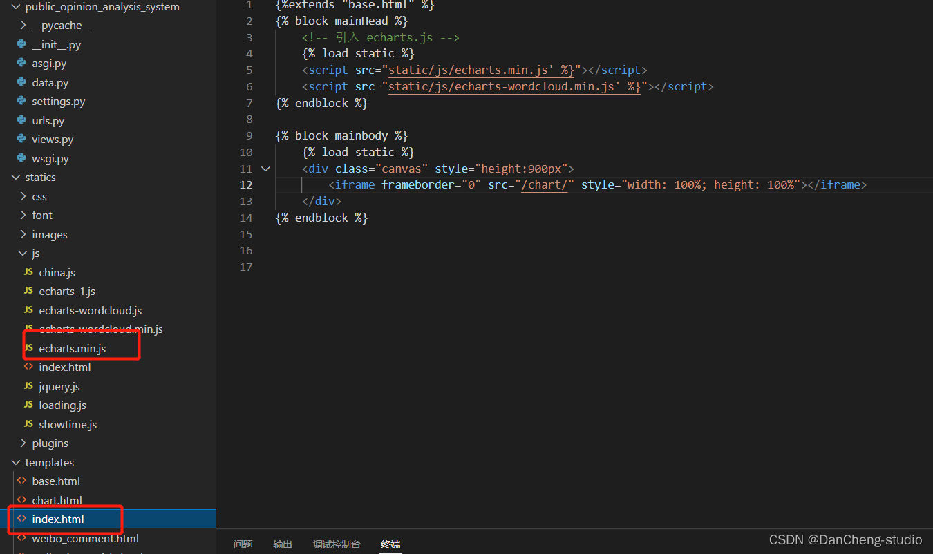
- js 目录中为 echarts的 js 文件,大家可以在 echarts官网下载自己需要的版本,index.html 文件内容如下
#部分代码,不完整
<!DOCTYPE html>
<html lang="en">
<head>
    <meta charset="UTF-8">
    <title>基于情感分析的网络舆情热点评估与分析系统</title>
    <link rel="stylesheet" href="/static/plugins/bootstrap-3.3.7-dist/css/bootstrap.css">
    <script type="text/javascript" src="/static/js/jquery.js"></script>
    {% block mainHead %}
    {% endblock %}
</head>
<body>
{% load static %}
  <nav class="navbar navbar-inverse">
    <div class="container-fluid">
      <!-- Brand and toggle get grouped for better mobile display -->
      <div class="navbar-header">
         <a class="navbar-brand" href="#">
          <img src="{% static 'images/logo.ico' %}" alt="logo" width=24 height=24>
        </a>
        <button type="button" class="navbar-toggle collapsed" data-toggle="collapse" data-target="#bs-example-navbar-collapse-1" aria-expanded="false">
          <span class="sr-only">Toggle navigation</span>
          <span class="icon-bar"></span>
          <span class="icon-bar"></span>
          <span class="icon-bar"></span>
        </button>
        <a class="navbar-brand" href="#">基于情感分析的网络舆情热点评估与分析系统</a>
      </div>

      <!-- Collect the nav links, forms, and other content for toggling -->
      <div class="collapse navbar-collapse" id="bs-example-navbar-collapse-1">
        <ul class="nav navbar-nav">
          <li class="active"><a href="/">首页 <span class="sr-only">(current)</span></a></li>
          <li><a href="/weibo_hot_article/">微博热点文章</a></li>
          <li><a href="/weibo_comment/">用户评论情感分析</a></li>
        </ul>
<!--        <form class="navbar-form navbar-left">-->
<!--          <div class="form-group">-->
<!--            <input type="text" class="form-control" placeholder="Search">-->
<!--          </div>-->
<!--          <button type="submit" class="btn btn-default">搜索</button>-->
<!--        </form>-->
        <ul class="nav navbar-nav navbar-right">
          <li><a href="/admin/" target="_blank">前往后台</a></li>
        </ul>
      </div><!-- /.navbar-collapse -->
    </div><!-- /.container-fluid -->
  </nav>
    {% block mainbody %}
       <p>original</p>
    {% endblock %}
</body>
</html>
编写 views.py 文件,将数据库中的数据传到前端页面中
import json
from multiprocessing import connection
from sqlite3.dbapi2 import IntegrityError

from django.core import serializers
from django.core.serializers.json import DjangoJSONEncoder
from django.forms import model_to_dict
from django.http import HttpResponse, JsonResponse
from django.shortcuts import render


def index(request):
    # print(request.method)  #获取请求方式GET或POST
    return render(request, 'index.html')  # 回复一个页面
- 您还可以看一下 童金浩老师的跟风舞烟学大数据可视化-Echarts从入门到上手实战课程中的 【part03-Echarts十大常见组件详解】气泡图(bubble)详解小节, 巩固相关知识点
如果你已经解决了该问题, 非常希望你能够分享一下解决方案, 写成博客, 将相关链接放在评论区, 以帮助更多的人 ^-^