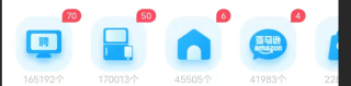
uni-app图片的角标应该怎么写
uni-app图片的角标应该怎么写?角标的数据是后端来的
<scroll-view class=" mx-4 border align-center"
            style="height: 220rpx;width: 100%; white-space: nowrap; margin-left: 10px;" scroll-x="true"
            android:scrollbars="none">
            <view class="home-view" @click="interest()">
                <image class="logi" src="../../static/tab/home-logo.png">image>
                <p class="home-p">{{vacancy}}个p>
                <p class="home-z">招聘p>
            view>
            <view class="home-view">
                <image class="logi" src="../../static/tab/home-logo.png">image>
                <p class="home-p">{{tabData[1].plateTotalNum}}个p>
                <p class="home-z">闲置交换p>
            view>
            <view class="home-view">
                <image class="logi" src="../../static/tab/home-logo.png">image>
                <p class="home-p">{{tabData[2].plateTotalNum}}个p>
                <p class="home-z">自家房招租p>
            view>
            <view class="home-view">
                <image class="logi" src="../../static/tab/home-logo.png">image>
                <p class="home-p">{{tabData[3].plateTotalNum}}个p>
                <p class="home-z">日亚测评p>
            view>
            <view class="home-view">
                <image class="logi" src="../../static/tab/home-logo.png">image>
                <p class="home-p">{{tabData[4].plateTotalNum}}个p>
                <p class="home-z">帮带p>
            view>
            <view class="home-view">
                <image class="logi" src="../../static/tab/home-logo.png">image>
                <p class="home-p">{{tabData[5].plateTotalNum}}个p>
                <p class="home-z">广告互推p>
            view>
        scroll-view>
该回答引用GPTᴼᴾᴱᴺᴬᴵ
要在uni-app的图片上添加角标,可以在图片上添加一个覆盖层,使用绝对定位和z-index属性将角标显示在图片上方。
以下是一个简单的示例代码,假设角标数据是通过uni-app的数据绑定获取的:
<template>
  <div class="image-container">
    <image :src="imageUrl" class="image"></image>
    <div class="badge">{{badgeCount}}</div>
  </div>
</template>

<style>
  .image-container {
    position: relative;
    display: inline-block;
  }
  .badge {
    position: absolute;
    top: -5px;
    right: -5px;
    background-color: red;
    color: white;
    border-radius: 50%;
    width: 20px;
    height: 20px;
    text-align: center;
    line-height: 20px;
    font-size: 12px;
    z-index: 1;
  }
</style>

<script>
  export default {
    props: {
      imageUrl: {
        type: String,
        required: true
      },
      badgeCount: {
        type: Number,
        required: true
      }
    }
  }
</script>
在这个示例中,我们使用了一个包含图片和角标的div容器,将角标添加到图片上方。.image-container的position属性被设置为relative,使其成为绝对定位的角标的容器。.badge样式规定角标的样式,包括颜色、大小、圆角等。通过绑定属性,我们可以将图片的URL和角标计数传递给组件。
·
请注意,这只是一个基本示例,您可以根据自己的需要进行调整和修改。
可以将角标定义成一个模板,然后进行整体设置
参考GPT和自己的思路:
关于uni-app图片的角标,可以通过以下步骤实现:
- 可以在图片上通过绝对定位的方式加上角标,角标的样式可以自定义。比如:
<view style="position:relative;display:inline-block;">
  <image src="../../static/tab/home-logo.png"></image>
  <span style="position:absolute;top:-5px;right:-5px;font-size:12px;background-color:red;color:white;padding:2px;">角标</span>
</view>
- 关于角标的数据是后端来的,可以在获取数据之后,通过v-for指令遍历数据,并在对应的图片上加上角标。比如:
<scroll-view class=" mx-4 border align-center"
 style="height: 220rpx;width: 100%; white-space: nowrap; margin-left: 10px;" scroll-x="true"
 android:scrollbars="none">
 <view class="home-view" @click="interest()">
 <image class="logi" src="../../static/tab/home-logo.png"></image>
 <span v-if="vacancyBadge" class="badge">{{vacancyBadge}}</span>
 <p class="home-p">{{vacancy}}个</p>
 <p class="home-z">招聘</p>
 </view>
 <view class="home-view">
 <image class="logi" src="../../static/tab/home-logo.png"></image>
 <span v-if="plateBadge" class="badge">{{plateBadge}}</span>
 <p class="home-p">{{tabData[1].plateTotalNum}}个</p>
 <p class="home-z">闲置交换</p>
 </view>
 ...
 </scroll-view>
在以上代码中,通过v-if指令判断是否需要展示角标,并通过差值表达式在角标中动态绑定角标的值。
参考GPT和自己的思路:
针对您的问题,可以通过在图片上方加上一个带数字的角标来展示后端传来的数据。具体实现方式如下:
首先,在每个需要展示角标的图片下面添加一个
view元素,并设置一个唯一的class名字,比如badge。在 CSS 样式表中,为这个
badge类添加样式,包括位置、背景颜色、边框、字体大小、字体颜色等。在对应的 JS 文件中,可以使用后端传来的数据来动态修改对应的角标数字,使用
uni.$on()监听数量变化事件。在数据更新后,可以将角标元素的内容进行修改,使用
uni.$set()方法即可。
以下是示例代码:
<scroll-view class=" mx-4 border align-center"
 style="height: 220rpx;width: 100%; white-space: nowrap; margin-left: 10px;" scroll-x="true"
 android:scrollbars="none">
 <view class="home-view" @click="interest()">
   <image class="logi" src="../../static/tab/home-logo.png"></image>
   <view class="badge"> {{ vacancy }} </view>
   <p class="home-z">招聘</p>
 </view>
 <view class="home-view">
   <image class="logi" src="../../static/tab/home-logo.png"></image>
   <view class="badge"> {{ tabData[1].plateTotalNum }} </view>
   <p class="home-z">闲置交换</p>
 </view>
 ...
</scroll-view>
<style scoped>
.badge {
position: absolute;
top: -5px;
right: -10px;
background-color: red;
color: white;
border-radius: 50%;
border: 1px solid white;
font-size: 12px;
height: 20px;
width: 20px;
text-align: center;
line-height: 20px;
}
</style>
<script>
export default {
data() {
return {
vacancy: 0,
tabData: […],
}
},
mounted() {
// 监听数量变化事件
uni.$on('vacancy_changed', (val) => {
this.vacancy = val;
// 修改角标元素的内容
uni.$set(this.$el.querySelectorAll('.badge')[0], 'textContent', val);
});
},
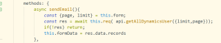
methods: {
interest() {
// 触发数量变化事件
uni.$emit('vacancy_changed', Math.floor(Math.random() * 100));
}
}
}
</script>
上述示例代码中:
badge类样式为定位在图片的右上角,背景为红色,白色边框和 12px 字体大小的圆形角标。mounted钩子函数中通过uni.$on()监听了数量变化事件。interest方法通过uni.$emit()触发了数量变化事件,随机生成了一个新的数字。注意
uni.$set()方法用来动态修改 DOM 内容,而非直接修改 Vue 数据,从而避免不必要的 DOM 重绘。