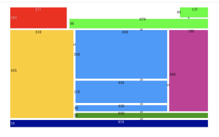
使用前端css该如何打出此图
初学,初学前端
使用前端,html5,css该如何打出此图内容,
若有帮助,望给个采纳,谢谢!
<!DOCTYPE html>
<html lang="en">
<head>
    <meta charset="UTF-8">
    <meta http-equiv="X-UA-Compatible" content="IE=edge" />
    <meta name="viewport" content="width=device-width,initial-sca">
    <title>Document</title>
    <style>
        body, html { margin: 0; padding: 0; }
    </style>
</head>
<body>

    <!--第一行-->
    <div style="width: 966px; height: 103px;">
        <!--左浮动-红色块-->
        <div style="float: left; width: 277px; height: 103px; background: #EA3223; "></div>
        <!--右浮动-绿色区域-->
        <div style="float: left; width: 679px; height: 103px; margin-left: 10px; ">
            <div style="float: right; width: 137px; height: 49px; background: #75F94C;"></div>
            <div style="float: right; width: 679px; height: 49px; background: #75F94C; margin-top: 8px;"></div>
        </div>
    </div>

    <!--第二行-->
    <div style="width: 970px; height: 435px;margin-top:10px;">
        <!--左浮动-黄色块-->
        <div style="float: left; width: 310px; height: 435px; background: #F8CD46;"></div>
        <!--右浮动区域--->
        <div style="float: left; width: 650px; height: 435px; margin-left: 10px; ">
            <!--上区域-->
            <div style="float: left; width: 650px; height: 400px;">
                <!--左边蓝色区域-->
                <div style="float:left;width:450px;height:400px;">
                    <!--第一个蓝色块-->
                    <div style="width: 450px; height: 240px; background: #4F99F7;"></div>
                    <!--第二个蓝色块-->
                    <div style="width: 450px; height: 110px; background: #4F99F7;margin-top:10px;"></div>
                    <!--第三个蓝色块-->
                    <div style="width: 450px; height: 30px; background: #4F99F7;margin-top:10px;"></div>
                </div>
                <!--右边紫色区域-->
                <div style="float: left; width: 190px; height: 400px; margin-left: 10px; background: #BB4295;"></div>
            </div>
            <!--下区域-->
            <div style="float: left; width: 650px; height: 25px; margin-top: 10px; background: #509C2C; "></div>
        </div>
    </div>

    <!--第三行-->
    <div style="width: 970px; height: 35px; margin-top: 10px; background: #000F91;"></div>

</body>
</html>
图上有好多个“块”,你可以一个一个先单独完成,最后再考虑排列的
如:第一行有红块、小绿块、大绿块,先画出来,再进行位置的排列
 <div style="display:block;width:970px;margin:0 auto;"> <!-- 定义总容器宽度 -->
  <div style="display:inline-block;background:red;width:277px;height:103px;float:left;"></div>
  <div style="display:inline-bolck;width:137px;height:49px;background:green;float:right"></div>
  <div style="display:inline-bolck;width:679px;height:46px;background:green;float:right;margin-top:8px;"></div>
  <div style="clear:both;"></div>
  <!-- 上边三个用的 float 布局 -->
  <!-- 下边的用 flex 布局 -->
  <div style="display:flex;justify-content:space-between;margin-top:10px;"> <!-- 如果所有紧跟着的元素定宽,则自动分布 -->
    <div style="width:310px;height:435px;background:yellow;"></div>
    <div style="width:650px;">
        <div style="width:100%;display:flex;justify-content:space-between;">
            <div style="flex:1;margin-right:10px;"> <!-- 这里定义右边空出的距离,剩余宽度由 flex:1 自动占满 -->
                <div style="height:240px;background:blue;"></div>
                <div style="height:110px;background:blue;margin-top:10px;"></div>
                <div style="height:30px;background:blue;margin-top:10px;"></div>
            </div>
            <div style="height:400px;width:190px;background:purple;"></div>
        </div>
        <div style="background:green;height:25px;margin-top:10px;"></div>
    </div>
  </div>
  <div style="height:35px;background:blue;margin-top:10px;"></div>
  </div>
若不考虑排版结构,直接一路position: absolute;开始狂飙