这个样式怎么用css实现?
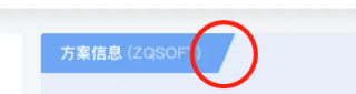
这个样式怎么用css实现?怎么用css实现
以下请疏忽,凑字数
提个问题
<!DOCTYPE html>
<html lang="en">
<head>
    <meta charset="UTF-8">
    <meta name="viewport" content="width=device-width, initial-scale=1.0">
    <title>Document</title>
    <style>
        .pick{
  position: absolute;
  z-index: 999;
  left: 0;
  top: 0;
  background: blue;
  line-height: 20px;
  padding: 0 8px 0 10px;
  color: #fff;
  font-size: 16px;
  text-align: center;
}

.pick::after{
  content: ' ';
  position: absolute;
  top: 0;
  right: -8px;
  border-width: 20px 8px;
  border-style: solid;
  border-color:blue transparent transparent transparent;
}
    </style>
</head>

<body>
    <div class="pick">
        <div>方案信息</div>
    </div>
</body>
</html>
css 画个正方形旋转
- 帮你找了个相似的问题, 你可以看下: https://ask.csdn.net/questions/7709517
- 这篇博客也不错, 你可以看下登录过滤器,css样式过滤问题解决方法