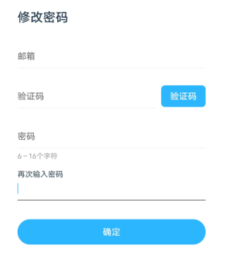
css这种输入框怎么做?
uni-app css这种输入框怎么做?点击输入框提示文字移动到上面去
uni-app css这种输入框怎么做?点击输入框提示文字移动到上面去
仅供参考:
这个功能通常称为"placeholder"效果,可以通过CSS来实现。
以下是一种常见的实现方式:
1.在HTML中,在input标签中添加placeholder属性,来设置input框的提示文字。
<input type="text" placeholder="请输入内容">
2.在CSS中,使用:focus伪类来控制input框的样式,当input框被聚焦时(即鼠标光标点击文本框时),使用绝对定位将placeholder文字移动到input框上面。
input[type="text"] {
  position: relative;
  z-index: 1; /* 提高层级,使其在提示文字上方 */
}

input[type="text"]:focus::placeholder {
  color: transparent; /* 隐藏placeholder文字 */
}

input[type="text"]:focus {
  /* 在input框上方添加绝对定位的placeholder文字 */
  position: absolute;
  top: 0;
  left: 0;
  z-index: 2;
}
这样就可以实现当鼠标光标点击文本框时,文本框的提示文字跑到input框上面的效果了。
<!DOCTYPE html>
<html>
    <head>
        <meta charset="utf-8" />
        <meta name="viewport" content="width=device-width, initial-scale=1">
        <title></title>
    </head>
<style>
.login{
    width: 500px;
    position: relative;
    margin-top: 50px;
}
.login input{
    outline: none;
    border: none;
    width: 100%;
    padding: 10px 0;
    color: #000;
    font-size: 16px;
    border-bottom: 1px solid black;
    background: none;
}
.login label{
    position: absolute;
    top: 10px;
    left: 0;
    color: #000;
    font-size: 14px;
    pointer-events: none;
    /*加个过度*/
    transition: all 0.5s;
}

.login input:focus + label,
.login input:valid + label{
    font-size: 12px;
    top: -20px;
}
</style>
    <body>

        <div class="login">
            <input type="" name="" id="" value="" required="required" />
            <label>再次输入密码</label>
        </div>

    </body>
</html>
在输入框上面加一个隐藏的div,文本提前写好,然后监听文本框的focus事件,触发的时候让上面的那个隐藏div显现就可以了
第一步:写一个动态的placeholder,默认是“再次输入密码”,当你鼠标点击输入框,也就是输入框发生focus事件的时候,placeholder为空
第二步:再写一个任意标签,里面写“再次输入密码”,默认隐藏,当输入框发生focus的时候,让它显示
提前给隐藏的标签留好空位,不留的话,你输入框发生事件的时候,会发生一个把输入框挤下去的情况
这个 那 只能 一个 span 然后 ,input 获取焦点 然后 span 加个动画 就行 。
- 你看下这篇博客吧, 应该有用👉 :css-移动端特点