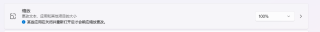
显示器的不同缩放比例对网站页面的影响
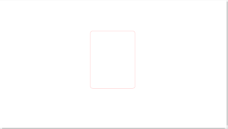
100%下的页面

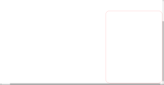
175%下的页面
请问这个问题该如何解决,页面是按100%来设计的但显示出来的却不尽人意。请指点一二
你可以用定位来固定你的盒子,子绝父相
以下代码只是做了个简单的测试
<!DOCTYPE html>
<html lang="en">
<head>
  <meta charset="UTF-8">
  <meta http-equiv="X-UA-Compatible" content="IE=edge">
  <meta name="viewport" content="width=device-width, initial-scale=1.0">
  <title>Document</title>
</head>
<style>
  div{
    width: 300px;
    height: 500px;
    border-radius: 3%;
    border: 1px solid red;
    margin: 0 auto;
    margin-top: 200px;
  }
</style>
<body>
  <div>

  </div>
</body>
</html>
你代码怎么处理的,直接用固定边距推到中间吗。
可以用定位或者flex布局做居中