如何更改div布局问题
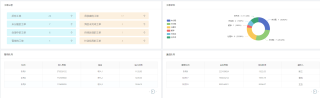
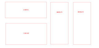
图一的布局更改为图二的布局,应该怎么改呀?
123451234512345
<div style="display:flex">
  <div>
    <div>工单状态</div>
    <div>工单分析</div>
  </div>
  <div>通话队列</div>
  <div>等待队列</div>
</div>
对应的外层div设置下宽高不就行了么,里边属性什么又不用改
两种方案

- 这篇文章:前端DIV布局浮动问题解决 也许有你想要的答案,你可以看看
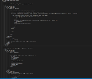
那你放到一个 a-row里就行 然后 平均分 24份就好了 a-col
这样 也行但不太好 。楼上的 方法应该 可以
.left {
        /* width: 500px; */
        width: 100%;
        height: 50%;
        margin: 12px 0;
        background: red;
      }
      .right {
        width: 50%;
        height: 100%;
        background: blue;
        margin: 0 12px;
      }
      .box {
        width: 100%;
        display: flex;
        height: 100%;
      }
<a-row type="flex">
      <a-col :span="12">
        <div class="left">1</div>
        <div class="left">2</div>
      </a-col>
      <a-col :span="12">
        <div class="box">
          <div class="right">3</div>
          <div class="right">4</div>
        </div>
      </a-col>
    </a-row>
使用弹性盒子布局