vue添加多个echart组件
怎么把好几个echart柱状图、饼状图放在一个vue里面?页面也没报错,就是显示不出来
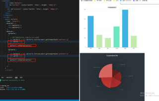
vue代码如下:
<template>
  <div class="myChart">
  <div id="barChart" :style="{width: '800px', height: '600px'}">
  </div>
    <div id="pieChart" :style="{width: '800px', height: '600px'}">
    </div>
  </div>
</template>
<script>
export default{
  name: 'ECharts',
  mounted() {
    this.myChart1();
    this.myChart2();
  },
  methods:{
    myChart1()
    {
      // 基于准备好的dom,初始化echarts实例
      let myChart1 = this.$echarts.init(document.getElementById('barChart'))
      myChart1.option = {
        title: {
          text: '水果销量统计',
          left: 'center',
          top: 20,
          textStyle: {
            color: '#555555'
          }
        },
        tooltip: {},
        xAxis: {
          data: [
            "苹果",
            "香蕉",
            "橘子",
            "火龙果",
            "葡萄",
            "西瓜"
          ]
        },
        yAxis: {},
        series: [{
          name: '销量',
          type: 'bar',
          data: [
            {
              value: 333,
              itemStyle: {
                color: "#3fb1e3"
              }
            },
            {
              value: 133,
              itemStyle: {
                color: "#c4ebad"
              }
            },
            {
              value: 99,
              itemStyle: {
                color: "#c4ebad"
              }
            },
            {
              value: 222,
              itemStyle: {
                color: "#6be6c1"
              }
            },
            {
              value: 399,
              itemStyle: {
                color: "#3fb1e3"
              }
            },
            {
              value: 123,
              itemStyle: {
                color: "#c4ebad"
              }
            }
          ]
        }]
      }
    },
    myChart2()
    {
      let myChart2 = this.$echarts.init(document.getElementById('pieChart'))
      myChart2.option = {
        backgroundColor: '#2c343c',
        title: {
          text: 'Customized Pie',
          left: 'center',
          top: 20,
          textStyle: {
            color: '#ccc'
          }
        },
        tooltip: {
          trigger: 'item'
        },
        visualMap: {
          show: false,
          min: 80,
          max: 600,
          inRange: {
            colorLightness: [0, 1]
          }
        },
        series: [
          {
            name: 'Access From',
            type: 'pie',
            radius: '55%',
            center: ['50%', '50%'],
            data: [
              {value: 335, name: 'Direct'},
              {value: 310, name: 'Email'},
              {value: 274, name: 'Union Ads'},
              {value: 235, name: 'Video Ads'},
              {value: 400, name: 'Search Engine'}
            ].sort(function (a, b) {
              return a.value - b.value;
            }),
            roseType: 'radius',
            label: {
              color: 'rgba(255, 255, 255, 0.3)'
            },
            labelLine: {
              lineStyle: {
                color: 'rgba(255, 255, 255, 0.3)'
              },
              smooth: 0.2,
              length: 10,
              length2: 20
            },
            itemStyle: {
              color: '#c23531',
              shadowBlur: 200,
              shadowColor: 'rgba(0, 0, 0, 0.5)'
            },
            animationType: 'scale',
            animationEasing: 'elasticOut',
            animationDelay: function (idx) {
              return Math.random() * 200;
            }
          }
        ]
      }
    }
  },
}
</script>
myChart1.setOption(option1);
https://blog.csdn.net/weixin_44058725/article/details/104802726
- 建议你看下这篇博客👉 :在vue中使用Echart图表