ggplot2绘图问题
library(ggplot2)
library(dplyr)
data("mtcars")
data1 <- mtcars %>% group_by(carb) %>% summarise_at(.vars = "mpg",.funs = mean)
ggplot(data =data1,aes(x = carb,y = mpg))+geom_line( color = "red")+
xlim(0,20)+ylim(0,20)+coord_fixed(ratio = 1/1)+
geom_abline(intercept = 0,slope = 1.5)
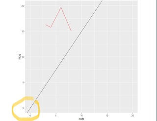
以上是代码和结果,我的问题是x轴和y轴不在同一个起点上(即x起点0和y起点0是分开的),如何让X轴和Y轴的起点在同一个点上呢?请提供完整代码,谢谢。
ggplot(data =data1,aes(x = carb,y = mpg))+geom_line( color = "red")+
coord_fixed(ratio = 1/1) + geom_abline(intercept = 0,slope = 1.5) +
scale_x_continuous(limits=c(0,20),expand=c(0,0)) +
scale_y_continuous(limits=c(0,20),expand=c(0,0))
Any ggplots side-by-side (or n plots on a grid)
The function grid.arrange() in the gridExtra package will combine multiple plots; this is how you put two side by side.
require(gridExtra)
plot1 <- qplot(1)
plot2 <- qplot(1)
grid.arrange(plot1, plot2, ncol=2)
This is useful when the two plots are not based on the same data, for example if you want to plot different variables without using reshape().
This will plot the output as a side effect. To print the side effect to a file, specify a device driver (such as pdf, png, etc), e.g.
pdf("foo.pdf")
grid.arrange(plot1, plot2)
dev.off()
or, use arrangeGrob() in combination with ggsave(),
ggsave("foo.pdf", arrangeGrob(plot1, plot2))
This is the equivalent of making two distinct plots using par(mfrow = c(1,2)). This not only saves time arranging data, it is necessary when you want two dissimilar plots.
Appendix: Using Facets
Facets are helpful for making similar plots for different groups. This is pointed out below in many answers below, but I want to highlight this approach with examples equivalent to the above plots.
mydata <- data.frame(myGroup = c('a', 'b'), myX = c(1,1))
qplot(data = mydata,
x = myX,
facets = ~myGroup)
ggplot(data = mydata) +
geom_bar(aes(myX)) +
facet_wrap(~myGroup)
Update
the plot_grid function in the cowplot is worth checking out as an alternative to grid.arrange. See the answer by @claus-wilke below and this vignette for an equivalent approach; but the function allows finer controls on plot location and size, based on this vignette.