有没有哪位做过前端线性图表
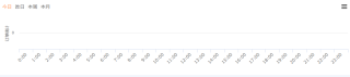
就是在vue中做线性图表,可以像下图一样,点击不同的时间,就会改变不同的图表状态
比如点击今天跟本周跟本月都能改变不同的状态,我在网上看到的用echarts做的,如下图
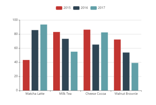
只能在同一个状态下,然后挤一块,处理不了不同的时间状态,有哪位做过的帮一下,万分感谢
你这个 可以 是四个统计图 。点击时切换一下就行。
也可以是一个统计图 ,点击 时 绑定不同 的options配置也行
相当于是动态数据生成图表,可以看看https://blog.csdn.net/yolo_link/article/details/126073245
点击切换数据吗?
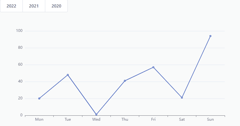
<template>
  <div>
    <el-button-group>
      <el-button
        v-for="(item, index) in years"
        :key="index"
        @click="handleYears(item)">{{item}}</el-button>
    </el-button-group>
    <div class="chart" ref="chart"></div>
  </div>
</template>

<script>
import * as echarts from 'echarts'

export default {
  data () {
    return {
      years: ['2022', '2021', '2020'],
      chart: null
    }
  },
  mounted () {
    this.initChart()
  },
  methods: {
    initChart () {
      this.chart = echarts.init(this.$refs.chart)
      this.chart.setOption({
        xAxis: {
          type: 'category',
          data: ['Mon', 'Tue', 'Wed', 'Thu', 'Fri', 'Sat', 'Sun']
        },
        yAxis: {
          type: 'value'
        },
        series: [
          {
            data: [150, 230, 224, 218, 135, 147, 260],
            type: 'line'
          }
        ]
      })
    },
    handleYears () {
      // 随机生成数据,实际根据自己点击项获取数据
      const data = []
      for (let i = 0; i < 7; i++) {
        data.push(parseInt(Math.random() * 100))
      }
      this.chart && this.chart.setOption({
        series: [{
          data
        }]
      })
    }
  }
}
</script>

<style lang="scss" scoped>
.chart {
  width: 800px;
  height: 400px;
}
</style>
echarts demo集上面应该有吧,直接搜柱形图应该可以找到满足你需求的