flex布局,盒子大小不固定,换行出现问题
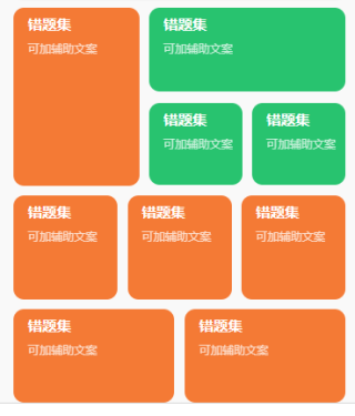
我想要达到的结果
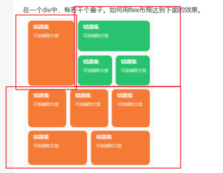
在一个div中,有若干个盒子。如何用flex布局达到下面的效果。
<div class="div">
        <div class="div1">1</div>
        <div class="div2">2</div>
        <div class="div3">3</div>
        <div class="div4">4</div>
        <div class="div5">5</div>
        <div class="div6">6</div>
        <div class="div7">7</div>
        <div class="div8">8</div>
        <div class="div9">9</div>
    </div>
<!DOCTYPE html>
<html lang="en">
    <head>
        <meta charset="UTF-8">
        <meta http-equiv="X-UA-Compatible" content="IE=edge">
        <meta name="viewport" content="width=device-width, initial-scale=1.0">
        <title>Document</title>
        <style>
            * {
                margin: 0;
            }

            .radius{
                border-radius: 8px;
            }

            .bg-orange{
                background: orange;
            }

            .bg-green {
                background: yellowgreen;
            }

            .head {
                height: 200px;
                width: 100%;
                display: flex;
            }

            .head .left {
                width: 40%;
                height: 100%;
                margin-right: 10px;
            }

            .head .right {
                display: flex;
                flex: 1;
                flex-direction: column;
            }

            .head .right .r-top {
                height: 50%;
                width: 100%;
            }

            .head .right .r-bottom {
                height: 50%;
                margin-top: 10px;
                display: flex;
                width: 100%;
            }

            .head .right .r-bottom .item {
                flex: 1;
            }

            .head .right .r-bottom .item:first-child {
                margin-right: 10px;
            }


            .body {
                width: 100%;
                height: 100px;
                display: flex;
                margin-top: 10px;
            }

            .body .item {
                flex: 1;
                margin-right: 10px;
            }

            .body .item:last-child {
                margin: 0;
            }

            .foot {
                width: 100%;
                height: 100px;
                display: flex;
                margin-top: 10px;
            }

            .foot .item {
                flex: 1;
                margin-right: 10px;
            }

            .foot .item:last-child {
                margin: 0;
            }


        </style>
    </head>
    <body>
        <div class="main">
            <div class="head">
                <div class='left bg-orange radius'></div>
                <div class='right'>
                    <div class='r-top bg-green radius'></div>
                    <div class='r-bottom'>
                        <div class='item bg-green radius'></div>
                        <div class='item bg-green radius'></div>
                    </div>
                </div>
            </div>

            <div class='body'>
                <div class='item radius bg-orange'></div>
                <div class='item radius bg-orange'></div>
                <div class='item radius bg-orange'></div>
            </div>

            <div class='foot'>
                <div class='item radius bg-orange'></div>
                <div class='item radius bg-orange'></div>
            </div>
        </div>
    </body>
</html>
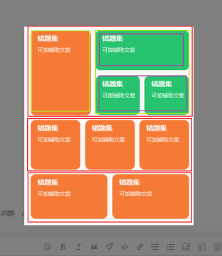
这个用一个flex肯定是实现不了的,但是如果绿色方块的高度都相同,地下两行高度相同的话可以可以通过添加flex-warp:warp 共用一个flexbox