antd中对话框宽度高度的调试
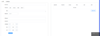
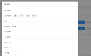
效果图是图一这样,图二我那个太长了,怎么让他分成两半呢 基于antd
import React, { useState } from 'react';
import {
Modal,
Form,
Input,
Tooltip,
Icon,
Cascader,
Select,
Row,
Col,
Checkbox,
Button,
AutoComplete,
Table,
} from 'antd';
const { Option } = Select;
const AutoCompleteOption = AutoComplete.Option;
const formItemLayout = {
labelCol: {
xs: { span: 24 },
sm: { span: 8 },
},
wrapperCol: {
xs: { span: 24 },
sm: { span: 16 },
},
};
const tailFormItemLayout = {
wrapperCol: {
xs: {
span: 24,
offset: 0,
},
sm: {
span: 16,
offset: 8,
},
},
};
const dataSource = [
{
key: '1',
name: '胡彦斌',
age: 32,
address: '西湖区湖底公园1号',
},
{
key: '2',
name: '胡彦祖',
age: 42,
address: '西湖区湖底公园1号',
},
];
const columns = [
{
title: '姓名',
dataIndex: 'name',
key: 'name',
},
{
title: '年龄',
dataIndex: 'age',
key: 'age',
},
{
title: '住址',
dataIndex: 'address',
key: 'address',
},
];
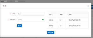
const CustomModal = (props) => {
const { form } = props;
const { getFieldDecorator } = form;
const [list, setList] = useState([]);
const [inform, setInform] = useState({});
return (
<Modal title="添加" visible footer={null} width={800}>
<Row gutter={20}>
<Col span={12}>
<Form {...formItemLayout}>
<Form.Item label="E-mail">
{getFieldDecorator('名称', {
initialValue: 'hello',
rules: [
{
type: 'email',
message: 'The input is not valid E-mail!',
},
{
required: true,
message: 'Please input your E-mail!',
},
],
})(<Input />)}
</Form.Item>
<Form.Item label="Password" hasFeedback>
{getFieldDecorator('password', {
initialValue: 'world',
rules: [
{
required: true,
message: 'Please input your password!',
},
],
})(<Input />)}
</Form.Item>
<Form.Item {...tailFormItemLayout}>
<Button type="primary" htmlType="submit" size="small">
添加
</Button>
</Form.Item>
</Form>
</Col>
<Col span={12}>
<Table pagination={false} dataSource={dataSource} columns={columns} bordered />
<Button type="primary" size="small" style={{ marginTop: '25px' }}>
提交订单
</Button>
</Col>
</Row>
</Modal>
);
};
export default Form.create({ name: 'custom_modal' })(CustomModal);