echarts 画图表问题
echarts 画图,看了下echarts 的示例没找到能画下边这种图的例子:
1.实现双Y轴
2.两个Y轴的点相连并切要是直线
如下图:
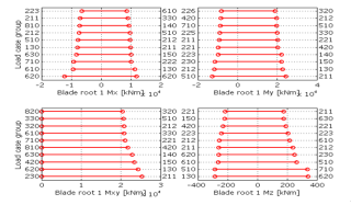
echarts 能否画这样的图或者用别的插件画,请指教。。
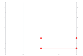
使用散点图,然后把一些点连起来
option = {
  color: "red",
  tooltip: {},
  xAxis: {
    type: "value",
  },
  yAxis: [
    {
    type: "category",
    data: ['3', '4', '1', '2', '5']
  },
  {
    type: "category",
    data: ['1', '2', '3','4', '5']
  }
    ],
  series: [
    {
      type: 'scatter',
      yAxisIndex: 1,
      symbolSize: 20,
      data: [
        ['1', '1'],
        ['1', '2'],
        ]
    },
    {
      symbolSize: 20,
      data: [
        ['2', '3'],
        ['2', '4'],
      ],
      markLine: {
              silent: true, // 鼠标悬停事件, true悬停不会出现实线
              symbol: 'none', // 去掉箭头
              data: [
                [
                  {
                    coord: ['1', '3'],
                    lineStyle: {
                      width: 1,
                      type: 'solid',
                      color: 'red',
                    },
                  },
                  {
                    coord: ['2', '3'],
                    lineStyle: {
                      width: 1,
                      type: 'solid',
                      color: 'red',
                    },
                  }
                ],
                [
                  {
                    coord: ['1', '4'],
                    lineStyle: {
                      width: 1,
                      type: 'solid',
                      color: 'red',
                    },
                  },
                  {
                    coord: ['2', '4'],
                    lineStyle: {
                      width: 1,
                      type: 'solid',
                      color: 'red',
                    },
                  }
                ]
              ]
            },
      type: 'scatter'
    }
  ]
};
恕我眼拙,没看出数据规律来,如果真没规律的话只能自定义图表了
有个魔法你要不要试试哈哈😎
这个叫什么图
k线图
可以用柱状图尝试,宽度设小,两头添加圈
这种可以不?
