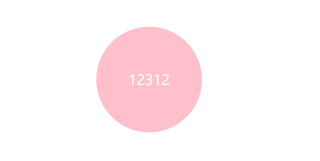
css3d盒子反转效果
效果
<!DOCTYPE html>
<html lang="en">

<head>
    <meta charset="UTF-8">
    <meta http-equiv="X-UA-Compatible" content="IE=edge">
    <meta name="viewport" content="width=device-width, initial-scale=1.0">
    <title>Document</title>
    <style>
        body {
            perspective: 300px;
        }

        .box {
            position: relative;
            width: 300px;
            height: 300px;
            margin: 100px auto;
            transition: all 1s;
            transform-style: preserve-3d;
        }

        .box:hover {
            transform: rotateY(180deg);
        }

        .font,
        .back {
            position: absolute;
            top: 0;
            left: 0;
            width: 100%;
            height: 100%;
            border-radius: 50%;
            font-size: 40px;
            text-align: center;
            line-height: 300px;
            color: #fff;
        }

        .font {
            background-color: pink;
            z-index: 1;
        }

        .back {
            background-color: purple;
            transform: rotateY(180deg);
        }
    </style>
</head>

<body>
    <div class="box">
        <div class="font">12312</div>
        <div class="back">4564645</div>
    </div>
</body>

</html>
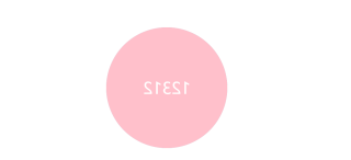
为啥紫色的盒子转不过来呀? transform-style: preserve-3d; 在父盒子中添加了呀?
问题应该出在font的z-index上,这恶鬼属性导致font永远在back之上
.font:hover {
transition: all 1s;
z-index: 0;
}
加上这个就能把紫色的显示出来,但是效果并不是太好
.front,
.back {
position: absolute;
top: 0;
left: 0;
width: 100%;
height: 100%;
border-radius: 50%;
font-size: 30px;
color: #fff;
text-align: center;
line-height: 300px;
backface-visibility: hidden;
}