Vue 如何让高度自适应
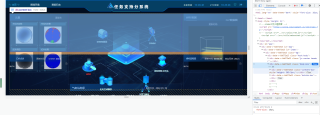
现在是给了flex布局,外层盒子高度是自适应的,但是里面的内容没有
<div class="body-box" v-if="logshow&&hjshow" :style="'height:'+bgheight+'px;'">//父级盒子
            <!-- 第一行数据 -->
            <div class="content-box"  :style="'height:'+((screenHeight-147)/2)+'px;'">
                    //这里是三个小组件横向排列
            <!-- 第二行数据 -->
            <div class="bototm-box">
                    //这里也是三个小组件横向排列
——JS
var screenHeight= document.documentElement.clientHeight;
  var screenWidth=document.documentElement.clientWidth;
  var ratio = screenHeight / 1080;
         console.log(ratio);
  var bgheight=ratio*1080;
  console.log(bgheight);
watch: {
          screenHeight (val) {
            // 为了避免频繁触发resize函数导致页面卡顿,使用定时器
            if (!this.timer) {
              // 一旦监听到的screenWidth值改变,就将其重新赋给data里的screenWidth
              this.screenHeight = val
              this.timer = true
              let that = this
              setTimeout(function () {
                // 打印screenWidth变化的值
                console.log(that.screenHeight)
                that.timer = false
              }, 400)
            }
          },
          screenWidth (val) {
            if (!this.timer) {
              this.screenWidth = val
              this.timer = true
              let that = this
              setTimeout(function () {
                console.log(that.screenWidth)
                that.timer = false
              }, 400)
            }
          }
        },
<div style="height:100%"></div>
这样高度就随着父元素自适应啊