怎么把三个DIV弄在一行,
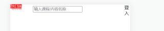
<div class="index-header">
<div class="d1"></div>
<div style="display: inline" class="search"><input type="hidden" id="URL_search" value="https://www.1-hj.com/search.html?type-course&uid=2"> <input type="text" placeholder="输入课程/内容名称" class="search-text"></div>
<div class="d3" onclick="location='URL'">登入</div>
```css
body{
margin:0px;
padding: 0;
}
.d1 {
display: inline;
width:40px;
height: 20px;
float:left;
background: url(./images/学汇百川.png);
background-size:100% 100%;
}
.search{
margin:0;
position: relative;
top: 0.3rem;
margin: 0 0.8rem;
background: #F5F6FA url(./images/搜索(1).png) no-repeat 0.5rem 50%;
background-size: 0.9rem 0.9rem;
border-radius: 1.6rem;
box-sizing: border-box;
padding: 0 0.5rem 0 1.6rem;
height: 1.6rem;
color: #929699;
}
.d3{
display:inline;
width:20px;
height: 20px;
float: right;
background-image: url(./images/登入(1).png);
background-size:100% 100%;
}
```
外面大div使用盒子模型设置即可,css如下:
.index-header {
            display:flex;
            justify-content:space-between;
            align-items:center;
        }
body{
margin:0;
padding: 0;
}
.d1 {
display: inline;
width:40px;
height: 20px;
border: 1px solid #000;
float:left;
background: url(./images/学汇百川.png);
background-size:100% 100%;
}
.search{
position: relative;
margin: 0 0.8rem;
background: #F5F6FA url(./images/搜索(1).png) no-repeat 0.5rem 50%;
background-size: 0.9rem 0.9rem;
border-radius: 1.6rem;
box-sizing: border-box;
padding: 0 0.5rem 0 1.6rem;
height: 1.6rem;
color: #929699;
}
.d3{
display:inline;
height: 20px;
background-image: url(./images/登入(1).png);
background-size:100% 100%;
}

<!DOCTYPE html>
<html>
<head>
<meta charset="UTF-8">
<title>Insert title here</title>
<style type="text/css">
.div1{
    background: #ff36;width:300px;height:200px;float:left;display:block;
}
.div2{
    background: #fc36;width:300px;height:200px;float:left;display:block;
}
.div3{
    background: #cf36;width:300px;height:200px;float:left;display:block;
}
</style>
</head>
<body>
<div class="div1"></div>
<div class="div2"></div>
<div class="div3"></div>
</body>
</html>
div+flex d1加 display: flex;
给博主提供三种方法
1.采用flex布局
2.使用float浮动
3.给盒子的display属性的属性值设置为inline -block