纯css可以控制按圆弧旋转吗
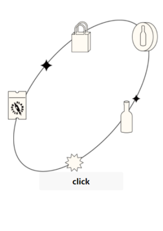
图上四个图片是一个整体 背后的轨迹也是一个整体,是否可以通过纯css控制图片旋转让其在背后的轨迹旋转

不过你的图片要拆开成单个,按照上面的示例调整下cubic-bezier参数
肯定是可以的
可以的哦;给你一个案例

<!DOCTYPE html>
<html lang="en">
<head>
<meta charset="UTF-8">
<title>纯CSS3模拟星体旋转效果</title>
<style>
.box{
    transform: scale(0.5);
    position: relative;
    padding: 1px;
    height: 300px;
    width: 300px;
    margin:100px auto;
}
.sunline{
    position:relative;
    height: 400px;
    width: 400px;
    border: 2px solid black;
    border-radius: 50%;
    margin: 50px 0 0 50px;
    display: flex;
    animation: rotate 10s infinite linear;
}
.sun{
    height: 100px;
    width: 100px;
    margin: auto;
    background-color: red;
    border-radius: 50%;
    box-shadow: 5px 5px 10px red,-5px -5px 10px red,5px -5px 10px red,-5px 5px 10px red;
}
.earthline{
    position: absolute;
    right: 0;
    top: 50%;
    height: 200px;
    width: 200px;
    margin: -100px -100px 0 0;
    border: 1px solid black;
    border-radius: 50%;
    display: flex;
    animation: rotate 2s infinite linear;
}
.earth{
    margin: auto;
    height: 50px;
    width: 50px;
    background-color: blue;
    border-radius: 50%;
}
.moon{
    position: absolute;
    left: 0;
    top: 50%;
    height: 20px;
    width: 20px;
    margin: -10px 0 0 -10px;
    background-color: black;
    border-radius: 50%;
}
@keyframes rotate{
    100%{transform:rotate(360deg);}
}
</style>
</head>
<body>

<div class="box">
    <div class="sunline">
        <div class="sun"></div>
        <div class="earthline">
            <div class="earth"></div>
            <div class="moon"></div>
        </div>
    </div>
</div>
</body>
</html>