请问这个怎么做微信小程序动画?
请问怎么在微信小程序里作出动画,就是从

这样动画成
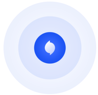
然后能够不断运行
代码片段:https://developers.weixin.qq.com/s/4hSavxmS7mvq
<view class="wave">
  <image src="./contact.png" mode="cover"></image>
</view>

.wave {
  width: 200rpx;
  height: 200rpx;
  margin: 40rpx auto;
  display: flex;
  justify-content: center;
  align-items: center;
  border-radius: 50%;
  overflow: hidden;
  position: relative;
}
.wave::before,
.wave::after {
  content: "";
  position: absolute;
  top: 0;
  left: 0;
  width: 100%;
  height: 100%;
  border-radius: 50%;
}
.wave::before {
  background-color: rgba(100, 134, 178, .4);
  animation: wave 2s infinite;
  z-index: 1;
}
.wave::after {
  background-color: rgba(100, 134, 178, .4);
  animation: wave 2s infinite;
  animation-delay: .3s;
  z-index: 2;
}
.wave image {
  width: 60rpx;
  height: 60rpx;
  position: absolute;
  border-radius: 50%;
  z-index: 3;
}
@keyframes wave {
  0% {
    opacity: 1;
    transform: scale(0);
  }
  100% {
    opacity: 0;
    transform: scale(1);
  }
}
使用css中animation 它有循环播放属性加上即可
看看这里https://www.runoob.com/cssref/css3-pr-animation.html
复制到小程序中运行,满意请采纳
布局:
<view class="container">
  <view class="wave ripple danger">
    <view class="circle"></view>
    <view class="circle"></view>
    <view class="circle"></view>
    <view class="content">
      <image  class="img" src="/images/wa.png" mode="cover"></image>
    </view>
  </view>
</view>

css:
.container {
  position: absolute;
  top: 30%;
  left: 30%;
  width: 40%;
  height: 40%;
}

.wave {
  position: relative;
  width: 100px;
  height: 100px;
  text-align: center;
  line-height: 100px;
  font-size: 28px;
}

.wave .circle {
  position: absolute;
  border-radius: 50%;
  opacity: 0;
}

/* 波纹效果 */
.wave.ripple .circle {
  width: calc(100% - 6px);
  /* 减去边框的大小 */
  height: calc(100% - 6px);
  /* 减去边框的大小 */
  border: 3px solid #fff;
}

.wave.ripple .circle:first-child {
  animation: circle-opacity 2s infinite;
}

.wave.ripple .circle:nth-child(2) {
  animation: circle-opacity 2s infinite;
  animation-delay: .3s;
}

.wave.ripple .circle:nth-child(3) {
  animation: circle-opacity 2s infinite;
  animation-delay: .6s;
}

.wave.ripple.danger {
  color: red;
}

.wave.ripple.danger .circle {
  border-color: blue;
  background-color: blue;
}

.wave.ripple.warning {
  color: orange;
}

.wave.ripple.warning .circle {
  border-color: orange;
}

.content {
  display: flex;
  align-items: center;
  justify-content: center;
  width: 100px;
  height: 100px;
}

.img {
  width: 60rpx;
  height: 60rpx;
  z-index: 99;
}

@keyframes circle-opacity {
  from {
    opacity: 1;
    transform: scale(0);
  }

  to {
    opacity: 0;
    transform: scale(1);
  }
}