前端内联块元素布局问题
<!DOCTYPE html>
<html lang="en">
<head>
    <meta charset="UTF-8">
    <meta http-equiv="X-UA-Compatible" content="IE=edge">
    <meta name="viewport" content="width=device-width, initial-scale=1.0">
    <link rel="stylesheet" href="./css/index.css">
    <title>Document</title>
    <style>

    </style>
</head>
<body>
    <!-- 顶部导航栏 -->
   <div class="top white" >

    </div>
    <!-- 左边栏 -->
    <div class="left"><span>1</span></div><!-- 内容栏 --><div class="content" style="background-color: aquamarine;"></div>
</body>
</html>
index.css内容如下:
*{
    margin: 0px;
    padding: 0px;
    outline: none;
}

html{
    height: 100%;
    width: 100%;
}
ul{
    list-style:none
}

 body{
    height: 100%;
    width: 100%;
    overflow: hidden;
    font-size: 1rem;
}

.top{
    height: 5%;
    background-color: #96b97d;
}

.top li{
    display: inline-block;
    margin: 10px 0 10px 40px;
    font-size: 1.2rem;
}

.left{
    width: 10%;
    height: 100%;
    background-color:red;
    display: inline-block;
}

.left li{
    margin: 10% 0% 0% 10%;
}

.white{
    color: #fff;
}

.content{
    width: 80%;
    height: 100%;
    display:inline-block;
}
渲染效果如下:

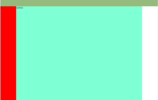
左侧栏没有显示出来,但是我把内容栏里的div加上“122312”左侧栏就能显示,修改如下:
<!DOCTYPE html>
<html lang="en">
<head>
    <meta charset="UTF-8">
    <meta http-equiv="X-UA-Compatible" content="IE=edge">
    <meta name="viewport" content="width=device-width, initial-scale=1.0">
    <link rel="stylesheet" href="./css/index.css">
    <title>Document</title>
    <style>

    </style>
</head>
<body>
    <!-- 顶部导航栏 -->
   <div class="top white" >

    </div>
    <!-- 左边栏 -->
    <div class="left"><span>1</span></div><!-- 内容栏 --><div class="content" style="background-color: aquamarine;">122312</div>
</body>
</html>
渲染效果图:
麻烦谁能解释下为啥会这样,感激不尽!
同一行的行内元素对齐方式默认是底部对齐,即vertical-align:baseline,你可以在.left跟.content 加一个vertical-align:top解决这个问题
<!DOCTYPE html>
<html lang="en">

<head>
    <meta charset="UTF-8">
    <meta http-equiv="X-UA-Compatible" content="IE=edge">
    <meta name="viewport" content="width=device-width, initial-scale=1.0">
    <link rel="stylesheet" href="./css/index.css">
    <title>Document</title>
    <style>
        * {
            margin: 0px;
            padding: 0px;
            outline: none;
        }

        html {
            height: 100%;
            width: 100%;
        }

        ul {
            list-style: none
        }

        body {
            height: 100%;
            width: 100%;
            overflow: hidden;
            font-size: 1rem;
        }

        .top {
            height: 5%;
            background-color: #96b97d;
        }

        .top li {
            display: inline-block;
            margin: 10px 0 10px 40px;
            font-size: 1.2rem;
        }

        .centerBox{
            display: flex;
            width: 100%;
            height: 90%;
        }
        .left {
            width: 10%;
            background: red;
        }

        .left li {
            margin: 10% 0% 0% 10%;
        }

        .white {
            color: #fff;
        }

        .content {
            width: 80%;
            height: 100%;

        }
    </style>
</head>

<body>
    <!-- 顶部导航栏 -->
    <div class="top white">
    </div>
    <div class="centerBox">
        <!-- 左边栏 -->
        <div class="left"><span>1</span></div><!-- 内容栏 -->
        <div class="content" style="background-color: aquamarine;"></div>
    </div>

</body>

</html>
你布局有问题的 。 中间部分应该用个div包裹 。然后就可以用flex布局 。或者 float (没有flex之前用float)。建议用flex。