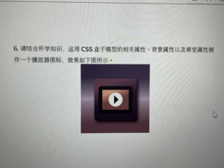
<div class="card">
        <div class="bg">
            <div class="video">
                <div class="play">
                    <span></span>
                </div>
            </div>
        </div>
    </div>
 .card {
        display: flex;
        flex-direction: row;
        justify-content: center;
        align-items: center;
        width: 240px;
        height: 240px;
        background-image: linear-gradient(purple, #eee, #482631);
    }
    .bg {
        display: flex;
        flex-direction: row;
        justify-content: center;
        align-items: center;
        width: 180px;
        height: 180px;
        background-image: linear-gradient(to bottom right, purple, #333);
        border-radius: 15px;
    }
    .video {
        display: flex;
        flex-direction: row;
        justify-content: center;
        align-items: center;
        width: 120px;
        height: 70px;
        background-image: linear-gradient(to bottom right, gold, #999);
        border: 10px solid #000;
        border-radius: 15px;
        overflow: hidden;
    }
    .play {
        display: flex;
        flex-direction: row;
        justify-content: center;
        align-items: center;
        width: 30px;
        height: 30px;
        border-radius: 50%;
        background-color: #fff;
        overflow: hidden;
    }
    span {
        border: 10px solid #fff;
        margin: 10px 0 10px 15px;
        border-left-color: #000;
    }
<!DOCTYPE html>
<html lang="zh-ch">
  <head>
    <meta charset="UTF-8" />
    <meta http-equiv="X-UA-Compatible" content="IE=edge" />
    <meta name="viewport" content="width=device-width, initial-scale=1.0" />
    <title>Document</title>
  </head>
  <style>
    * {
      padding: 0;
      margin: 0;
      box-sizing: border-box;
    }
    #Box {
      position: relative;
      margin: auto;
      width: 150px;
      height: 150px;
      line-height: 100px;
      text-align: center;
      background-color: rgb(162, 0, 255);
    }
    #seBox {
      position: absolute;
      height: 100px;
      width: 100px;
      background-color: sandybrown;
      border: 10px solid black;
      top: 50%;
      left: 50%;
      transform: translate(-50%, -50%);
    }
    #thBox {
      position: absolute;
      height: 50px;
      width: 50px;
      background-color: white;
      border-radius: 50%;
      top: 50%;
      left: 50%;
      transform: translate(-50%, -50%);
    }
    #foBox {
      position: absolute;
      width: 0px;
      height: 0px;
      border-style: solid;
      border-width: 10px 0 10px 16px;
      border-color: transparent transparent transparent #000000;
      top: 50%;
      left: 50%;
      transform: translate(-45%, -50%);
    }
  </style>
  <body>
    <div id="Box">
      <div id="seBox">
        <div id="thBox">
          <div id="foBox"></div>
        </div>
      </div>
    </div>
  </body>
  <script></script>
</html>