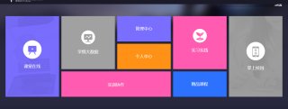
如何制作这个网页的这几个板块
如何用box来制作这个网页,求一个详细的代码,孩子现在乱的不行😭😭
<!doctype html>
<html lang="en">
<head>
<meta charset="UTF-8">
<meta name="viewport"
content="width=device-width, user-scalable=no, initial-scale=1.0, maximum-scale=1.0, minimum-scale=1.0">
<meta http-equiv="X-UA-Compatible" content="ie=edge">
<title>Document</title>
</head>
<body>
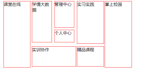
<div style="border: 0px solid red;width: 500px;height:250px" id="box">
<div style="width: 20%;height: 100%;float: left;border: 1px solid red;margin-left: 1%">课堂在线</div>
<div style="width: 33%;height: 100%;float: left;border: 0px solid red;margin-left: 1%">
<div style="width: 100%;height: 62%;float: left;border: 0px solid red;">
<div style="width: 45%;height: 100%;float: left;border: 1px solid red;">学情大数据</div>
<div style="width: 45%;height: 100%;float: left;border: 0px solid red;margin-left: 5%">
<div style="width: 99%;height: 64%;float: left;border: 1px solid red;">管理中心</div>
<div style="width: 99%;height: 30%;float: left;border: 1px solid red;margin-top: 10%">个人中心</div>
</div>
</div>
<div style="width: 100%;height: 30%;float: left;border: 1px solid red;margin-top: 10%">实训协作</div>
</div>
<div style="width: 20%;height: 100%;float: left;border: 0px solid red;margin-left: 1%">
<div style="width: 100%;height: 64%;float: left;border: 1px solid red;">实习实践</div>
<div style="width: 100%;height: 30%;float: left;border: 1px solid red;margin-top: 10%">精品课程</div>
</div>
<div style="width: 20%;height: 100%;float: left;border: 1px solid red;margin-left: 1%">掌上校园</div>
</div>
</body>
</html>
简单写了一点,你改下样式
<!DOCTYPE html>
<html lang="en">

<head>
    <meta charset="UTF-8">
    <meta http-equiv="X-UA-Compatible" content="IE=edge">
    <meta name="viewport" content="width=device-width, initial-scale=1.0">
    <title>Document</title>
    <style>
        div {
            margin: 0;
            padding: 0;
        }

        .box {
            width: 100%;
            height: 300px;
            display: flex;
        }

        .left,
        .right {
            width: 20%;
            height: 100%;
            background: red;
        }

        .center {
            width: 60%;
            height: 100%;
            display: flex;
            justify-content: center;
            flex-wrap: wrap;
            align-items: center;
        }

        .cTop {
            width: 100%;
            height: 60%;
            display: flex;
            justify-content: space-around;
        }

        .cbottom {
            width: 100%;
            height: 36%;
            display: flex;
            justify-content: space-around;
        }

        .cTopL,
        .cTopR {
            width: 30%;
            height: 100%;
            background: forestgreen;
        }

        .cTopC {
            width: 33%;
            height: 100%;
            display: flex;
            flex-direction: column;
            justify-content: space-around;
        }

        .cTopC>div {
            width: 100%;
            height: 48%;
            background: yellow;

        }

        .rL {
            width: 66%;
            background: red;
            height: 100%;
        }

        .rR {
            width: 30%;
            background: blueviolet;
            height: 100%;
        }
    </style>
</head>

<body>
    <div class="box">
        <div class="left"></div>
        <div class="center">
            <div class="cTop">
                <div class="cTopL"></div>
                <div class="cTopC">
                    <div></div>
                    <div></div>
                </div>
                <div class="cTopR"></div>
            </div>
            <div class="cbottom">
                <div class="rL"></div>
                <div class="rR"></div>
            </div>
        </div>
        <div class="right">

        </div>
    </div>
</body>
<script>

</script>

</html>
html+flex布局
https://www.ruanyifeng.com/blog/2015/07/flex-grammar.html