怎么样才可以实现这么一个效果

这样?
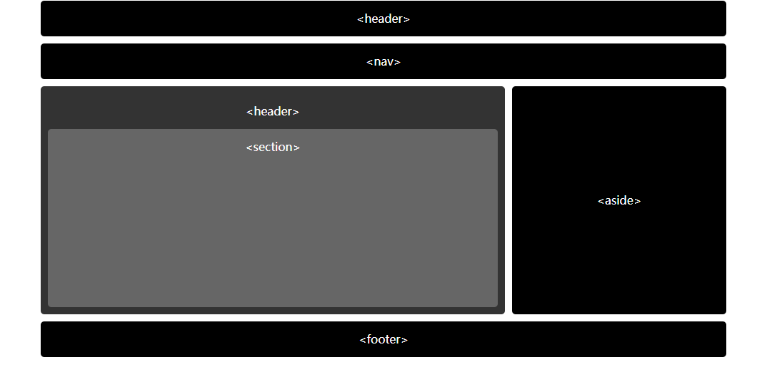
<!doctype html>
<style>
.wrap{max-width:960px;margin:0 auto;color:#fff;text-align:center;line-height:50px}
.border-radius{border-radius:5px;}
.header{background:#000}
.articles{overflow:hidden;}
.articles .article{padding:10px;background:#333;height:300px;margin-right:310px}
.articles section{background:#666;height:250px}
.articles section:hover{background:#000}
.articles aside{float:right;background:#000;line-height:320px;width:300px}
.footer{background:#000}
</style>
<div class="wrap">
<header class="header border-radius" style="margin-bottom:10px"><header></header>
<nav class="header border-radius" style="margin-bottom:10px"><nav></nav>
<div class="articles" style="margin-bottom:10px">
<aside class=" border-radius">
<aside>
</aside>
<div class="article border-radius">
<header>
<section class="section border-radius">
<section>
</section>
</div>
</div>
<footer class="footer border-radius"><footer></footer>
</div>
<!doctype html>
<html lang="en">
<head>
<meta charset="UTF-8" />
<meta name="viewport" content="width=device-width, initial-scale=1.0">
<meta http-equiv="X-UA-Compatible" content="IE=edge,chrome=1" />
<title> 页面名称 </title>
<style type="text/css">
.box {
cursor: pointer;
background-color: #2D3542;
width: 300px;
height: 100px;
transition: all 0.7s;
text-align: center;
line-height: 100px;
color: white;
border-radius: 5px;
}
.box:hover {
background-color: #1E222A;
}
</style>
</head>
<body>
<div class="box">
<section>
</div>
</body>
<script>
</script>
</html>