怎么弄这个程序,搞不了,求 指正
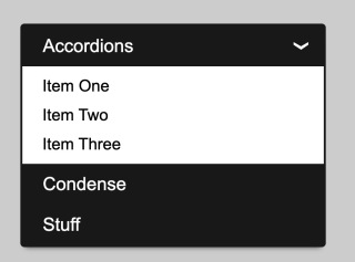
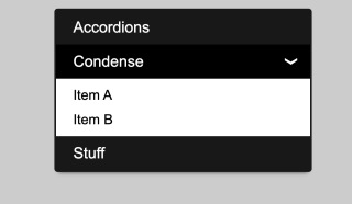
怎么弄下面这种点击效果啊
检查过代码不知道哪里有问题
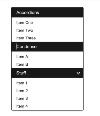
就是类似于下图的
    <ul class="akl radio">
        <li class="opl">
            <input type="radio" name="a-toggle" id="one" checked="">
            <label for="one" class="w-title">Accordions</label>
            <ul class="ol-items">
                <li>Item One</li>
                <li>Item Two</li>
                <li>Item Three</li>
            </ul>
        </li>
        <li class="opl">
            <input id="two" type="radio" name="a-toggle">
            <label for="two" class="w-title">Condense</label>
            <ul class="ol-items">
                <li>Item A</li>
                <li>Item B</li>
            </ul>
        </li>
        <li class="opl">
            <input id="tre" type="radio" name="a-toggle">
            <label for="tre" class="w-title">Stuff</label>
            <ul class="ol-items">
                <li>Item 1</li>
                <li>Item 2</li>
                <li>Item 3</li>
                <li>Item 4</li>
            </ul>
        </li>
    </ul>
html部分的
  *,
        *:before,
        *:after {
            box-sizing: border-box;
        }

        .akl {
            width: 300px;
            margin: 60px auto;
            border: 2px solid #181818;
            border-radius: 4px;
            box-shadow: 0 5px 5px -5px #333;
            list-style-type: none;
            padding: 0;
        }

        .akl .opl {
            position: relative;
            background: #fff;
        }

        .akl .opl .w-title {
            padding-left: 20px;
            height: 40px;
            font-size: 18px;
            line-height: 40px;
            background: #181818;
            color: #fff;
            position: relative;
            display: block;
            cursor: pointer;
        }

        .akl .opl .w-title :hover {
            background: #000000;
        }

        .akl .opl input {
            display: none;
        }

        .akl.opl input.active~.w-title:after,
        .akl .opl input:checked~.w-title:after,
        .akl.opl input:hover~.w-title:after {
            content: "›";
            position: absolute;
            width: 40px;
            font-size: 32px;
            right: 0;
            padding-left: 15px;
            top: 0;
            bottom: 0;
            transform: rotate( 90deg);
        }

        .akl.opl input.active~.ol-items,
        .akl .opl input:checked~.ol-items {
            height: auto;
            max-height: 900px;
        }

        .akl ul {
            list-style-type: none;
            padding-left: 0;
        }

        .akl .opl .ol-items li:first-child {
            padding-top: 10px;
        }

        .akl .opl .ol-items li {
            padding: 5px 20px;
        }
这是css部分
大佬,用li标签写,要想有这种效果得配合js
不知道用select标签吗,他可以直接使用,写css样式就行
就是图一是我展现出来的,但是没有图二和图三的点击效果