求解决:媒体查询与rem结合使用,只有背景色有效果,字体大小没有大小的变化
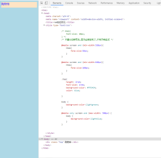
<!DOCTYPE html>
<html>
    <head>
        <meta charset="utf-8" />
        <meta name="viewport" content="width=device-width, initial-scale=1">
        <title>rem动态变化</title>
        <style type="text/css">

            @media screen and (min-width:320px){
                html{
                    fone-size:50px;
                }
            }

            @media screen and (min-width:640px){
                html{
                    fone-size:100px;
                }
            }

            .top{
                height: 2rem;
                font-size: 1rem;
                background-color: #FFE4C4;
                color: blue;

            }

            body {
                background-color:lightgreen;
            }

            @media only screen and (max-width: 500px) {
                body {
                    background-color:lightblue;
                }
            }

        </style>
    </head>
    <body>
        <div class="top">购物车</div>

    </body>
</html>
在html 里面是 font-size 不是fone-size 你看一下 名字写错了
fone-size是font-size
找到了,谢谢各位